

In the early days of the internet, search engines like Google only had to index the desktop version — rather, the only version — of a website.
Those days are long gone.
With the rise of smartphones and mobile internet, companies understood that people no longer rely primarily on personal computers to browse the web.
It was back in 2016 when mobile traffic surpassed desktop for the very first time. As such, a huge number of veteran digital marketers and online businesses probably saw Google’s mobile-first indexing initiative coming.
Put simply, mobile-first indexing means Google will start the indexing and ranking processes of a website with its mobile version. So, if you plan to do SEO to get better ranking in the SERPs, then you need to put a premium on mobile optimization practices.
If you aren’t up to date on how to rank well in the era of mobile-first indexing, you risk losing out on leads, conversions, and sales.
It’s because of this that you need to optimize your site for mobile-first indexing.
1. Create an XML Sitemap
XML sitemaps are documents that list all the pages (complete with URLs) on your website that you want Google to notice, index, and rank in search results.
Google uses XML sitemaps to understand web content better, so when it comes to indexing and ranking that content, it ends up in the most relevant search results.
And that’s the goal as a site owner, no matter what type of website you have.
If you use the WordPress content management system, creating an XML sitemap using the free Yoast SEO plugin is a cinch.
All you have to do is toggle on the XML sitemaps feature and let the plugin do the rest.
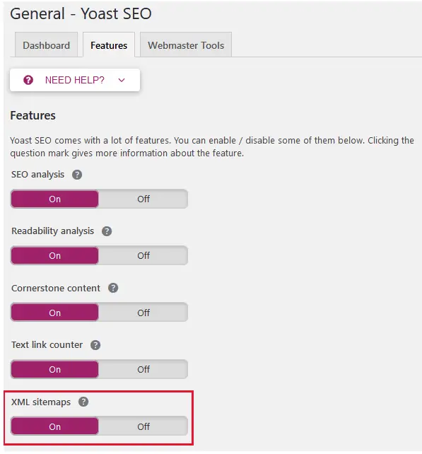
Yoast SEO will automatically create a sitemap of your site, including media URLs, and send it straight to Google for indexing.
If you don’t use WordPress and still want to create an XML sitemap, that’s not a problem. You can use a tool like Screaming Frog or XML-Sitemaps.com.
Just remember, if you use Google Search Console and have only verified your desktop site, make sure to add your mobile site too.
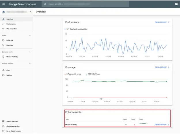
Google Search Console is a free service you can use to monitor your website’s presence in Google search results:
Confirm Google can crawl and index your site properlyFix indexing problems and re-index for higher rankingsView Google search traffic to your site, queries that led to your site, and how often your site appearsReceive alerts when Google finds indexing or spam issues on your siteDiscover other sites linking to yours
Lastly, you can use Google Search Console to troubleshoot issues regarding AMP and mobile usability to ensure your mobile-first indexing isn’t being negatively affected.
2. Focus on Metadata
Metadata is not just for letting those performing searches know what your website, or a specific piece of content, is all about.
Optimized metadata is just as helpful for letting crawlers understand your content, so it ends up in the right search results.

There are several types of metadata you need to keep in mind when doing mobile SEO:
Title Tag First and foremost, the title tag must clearly define what the page’s content is about to users and to search engines. In addition to containing your target keyword, be sure to keep the title tag within 78 characters to make sure it displays properly on mobile SERPs. Meta Description The meta description fills the important role of providing users some context about your business ideals, value propositions, and the specific topic being discussed in the page or post. For mobile SEO, keep it short and use simple words to make it more readable on a smaller screen. Meta Viewport Perhaps the most important piece of metadata for mobile optimization is meta viewport, which tells the browser how to handle the site’s display size and scaling. The good news is, you don’t have to manually use the meta viewport element if you’re using a website builder or content management system with themes that are mobile-responsive right off the bat.
And don’t forget to include metadata (alt tags) on all images too. They are ranked in search results just like site content.
If you operate an eCommerce site or drop-shipping business, it’s important you follow these best practices so your online store ranks well.
After all, 79% of people admit to making an online purchase from their smartphone in the last 6 months.
If you don’t want to lose out on sales, and risk being indexed by Google incorrectly, you’ll need to optimize your online shop properly.
To start, use the reliable eCommerce platform Shopify to launch your online store. It has 100’s of responsive themes to choose from that will render seamlessly on all mobile devices.
Next, install a drop-shipping management plugin Oberlo so you can generate more sales while reducing your overhead costs.
Oberlo is perfect for those wanting to focus on marketing their brand rather than dealing with things like inventory management, storage of items, and shipping customer orders.
But more than that, Oberlo makes editing your product pages a cinch. For example, you can customize page titles, descriptions, and image data.
Displaying your eCommerce shop using responsive design and customizing your product metadata are some of the best ways to optimize your site for mobile-first indexing.
3. Test the Mobile Experience
You might think you’ve optimized your website for an optimal mobile experience, only to later find out that people can’t read your content, navigate your site, or click your links.
That’s why routinely testing the mobile experience on your website is crucial to making sure mobile-first indexing helps you rather than hurts you.
Of course, testing your site on every single type of mobile device in existence is impossible.
However, you can use a free tool like Responsive Checker to help.
With this tool, you can test popular laptop, smartphone, and tablet devices, or scroll through a list of all devices if you want to check a specific model.
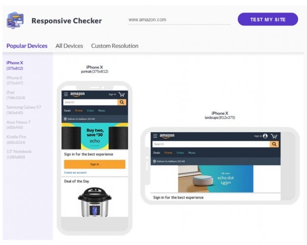
You can also navigate your site in real-time to make sure more than just your homepage display and functions correctly.
If you want to make sure people using mobile devices can view your site the way you want them to, this is the tool for you.
4. Avoid Mobile Popups
Popups are one of the most popular lead generation tools.
They grab people’s attention and encourage them to subscribe so you can use their information in your email marketing plan.
But the problem is, popups on mobile devices, especially small smartphone screens, are not only annoying, but they also disrupt the user experience and cause people to abandon sites.
One of the main reasons Google implemented mobile-first indexing is they want website owners to give people the best user experience possible.
This includes things like:
Fast loading page speedsFully functioning websitesEasy to use navigation menusGood web design including font style and size and color schemesGood use of keywords and relevant contentSocial signalsLocal search optimizationAnd more
That said, one of the best ways to ruin the user experience for those using mobile devices is to have popups appear on the mobile version of your site.
That’s because they interrupt what the user is doing, can be difficult to get rid of, and frustrate those looking for valuable information on their small devices.
Google knows this about popups and will not reward you with higher rankings if you use them on your mobile site.
Bonus Points
While optimizing a website for mobile first indexing is easily understood (and executed) by a seasoned marketer, the same cannot be said for budding entrepreneurs.
If you’re fairly new to the online space, the chances are good that this is the first time you’ve heard of mobile first indexing, and the other jargons we talked about sounded like rocket science.
If you’re in that scenario, then you can hire an online freelancer to help you with optimizing your website.
There are a plethora of benefits business owners can enjoy when working with freelancers.
In fact, regardless of the profit-making business idea that you built your business upon, you stand to benefit from working with freelancers.
Not only can they help with you with website optimization, but in the grand scheme of things, freelancers can help reduce your working hours, all while helping skyrocket your productivity.
Whether you’re looking to optimize your website, get more leads, produce content, or get more sales, you will most likely be able to find an online freelancer who can help you with just that.
Final Thoughts
Mobile-first indexing is not going anywhere.
Google wants to ensure website owners provide site visitors the best user experience possible, and that those experiences carry over to mobile users (as it should).
Because of this, you should continue learning how to optimize your website for mobile-first indexing so you can continue ranking well in search results and driving traffic to your site.
Such is especially the case if you’re an ecommerce store owner. If you don’t have a solid grasp of mobile-first indexing and how it can affect your website, you risk losing out on valuable leads, conversions, and sales.
Implement some of the tried and tested tips for optimizing your site for mobile-first indexing shared above. Just by taking action on the tips, your website becomes better positioned for ranking better, bring you more traffic and sales. If you have questions, suggestions, or ideas that you’d like to share, please do so in the comments section below. Cheers!
The post 4 Tried and Tested Tips to Optimizing Your Site for Mobile First Indexing appeared first on Mike Gingerich.
Read more: mikegingerich.com


