[ad_1]
July is Disability Pride Month, a time dedicated to celebrating the 60 million people with disabilities in the United States.
The month marks the anniversary of the Americans with Disabilities Act (ADA). Signed into law in July 1990, this piece of legislation was a major step toward achieving equal access for those with disabilities. The act specifically focused on making public transportation and spaces, employment, and government services more accessible.
More than thirty years later, we’re focusing on making another area more friendly to those with disabilities: digital media. The Web Content Accessibility Guidelines offer a set of standards to help ensure accessibility. To honor Disability Pride Month and help you create content to be enjoyed by all, let’s take a look at a few steps you can take to create accessible content.
1. Add closed captions
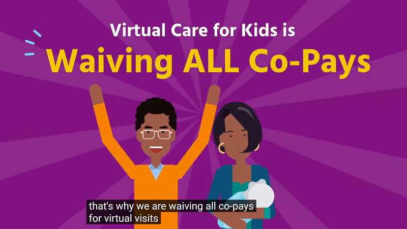
Closed captions—a textual display of what’s being said, with the ability to be toggled off—help people with hearing and visual impairments understand and enjoy the video content you create. The captions are also necessary for making 508-compliant video content. If you’re making any content for a government agency, the content must be 508-compliant.

Closed captions are an overlay on top of a completed video, as pictured above in this video from Virtual Care for Kids. If captions are built into the video itself, they are called “open captions.” There is no way for viewers to turn off open captions and it’s not possible for screen-reading software to understand them.
With a third-party tool, you can add proper closed captions to any video. Research your options for captioning apps and keep in mind that some programs are platform-specific. For example, Clipomatic or iPhone Clips work well for Instagram Stories.
Vyond’s 2023 Spring release introduced fast and efficient closed captioning for all your Vyond video projects. You can also read this guid on how to add closed captions to your Vyond videos.
2. Be mindful of video design
The design of a video itself is a huge factor in how accessible the content is. The wrong design choices can exclude audiences with certain disabilities. For example, if someone in your audience has a visual impairment, an overly-busy video could be difficult to interpret. But there are a couple of ways you can ensure that your video design is friendly to your entire audience.
- Keep text away from where closed captions will be. Cluttered screen text can be difficult to read for those who require closed captions. When placing text, keep in mind where closed captions will appear in order to prevent this from occurring.
- Ensure that your videos are safe for those with photo-sensitivities by avoiding the flash threshold. If videos have quick transitions or bright flashes in succession, they can cross the general flash threshold and cause epileptic seizures. Avoiding flashing effects is also helpful in consideration of people with ADHD, autism, and those in concussion recovery. Use tools to prevent this from happening.
- Be mindful of your color choices. More on this in #5 below.
- Consider representation in your content. Can you cast or include disabled people or animated characters? This won’t make your content inherently more accessible, but it will help disabled viewers see themselves represented in your message.
The above changes are easy to implement, but make a world of difference.
3. Use alt text on thumbnails
Alt text is copy that both supplements and even replaces an image when necessary. Alt text makes it possible for those with vision impairments to enjoy images and fully digest your content. A screen-reading program will read alt text where the image should be, giving a visually impaired listener an idea of what the image represents. This is equally true for video thumbnails that might be placed on an article.
See below how the image of a woman at her laptop has alt text in the website code to describe the details a screen reader couldn’t understand:

Alt text also helps with general readability if the image doesn’t load. If a user has an outdated browser or poor connection, the alt text will display in place of the image and ensure that the overall experience isn’t affected.
While the example above applies to images on websites, various video players offer alt text options for video thumbnails as well.
4. Transcribe visual or auditory media
For those with any kind of visual or learning impairment, videos on their own may not be enough. A transcript of what is said in the video makes it possible for people to slow down and learn at their own pace.
Not only are transcriptions useful for those needing assistance with a video, but they’re also great for creating additional content. For example, a transcript can be cleaned up and turned into a supplemental article that pairs with your video content on your company’s blog.
Use a third-party app or integration to transcribe your recorded videos. oTranscribe, Rev, and Express Scribe are three great options to start with. It’s also possible to transcribe live videos, such as webinars or conferences, to ensure that your content reaches as many people as possible.
5. Make the right color choices in video
Color vision deficiency affects nearly 7.4% of the population in the United States, meaning your choice of colors could keep 7.4% of people from fully enjoying what you create.
Those with color vision deficiency are often unable to clearly distinguish between red, blue, and green. While you can’t rebrand to cut certain colors, you can avoid layering red, blue, and green in visuals where the colors aren’t pertinent to understanding the message.
It’s also a good idea to use a contrast checker to make sure your text and background combinations are readable by those with color vision deficiency. Contrast requirements vary depending on the size of the text, so be as specific as possible when using a contrast tool.
6. Include video descriptions on social media
Include descriptive breakdowns of videos shared on social media to ensure that those with impairments can understand your posts.
Much like alt text on a website, video descriptions on social posts are typically read by a screen-reading program to help people who are visually impaired experience the content. It’s important to be as clear and as detailed as possible when writing video descriptions so your audiences can fully understand what is happening in your content.
Video descriptions can go in various places, depending on the social media platform. For example, Facebook has a video description area, whereas Twitter requires that you enable video descriptions under options first. If you can’t find an area to enter a video description on a certain platform, it’s possible you need to enter the description as the first comment on the post.
7. Remove autoplay from videos
Auto playing content on sites is distracting and downright impeding for people with certain disabilities. Someone using a screen reader will be unable to hear the page being read because the video will play at the same time as the screen reader. Those with focus problems can find themselves distracted and overwhelmed. It’s also possible for videos to trigger seizures in people with epilepsy, making autoplay videos a possible health hazard.
Whenever you upload or embed videos, be sure they’re set to play only when clicked. This ensures that your viewers get the experience that best suits them. It’s also a good idea to avoid having ads with audio on your site, because these will be equally distracting for people. Fortunately, many social platforms keep sound off on ads by default. But this is something worth double-checking.
Learn more about top web accessibility resources.
Tips for Getting Started
We reached out to Vyond customer and accessibility advocate Liz Schumacher, Engagement Manager at Rivermark Community Credit Union, for her advice on creating accessible content. According to Liz, “universal design is right for everyone. In addition to those protected by ADA, you or I can benefit when we’ve had too little sleep, or have an environmental issue—using a mobile device underground or when we require ease of access due to a temporary injury like a broken arm.” Here are a few of Liz’s recommendations for creating accessible content:
- Create a company style guide that incorporates accessibility considerations as part of mandatory brand guidelines for both internal and external communications. This way, content can be presented with accessibility for all as the default and nobody will need to take extra steps to access the content.
- Use personas with varying abilities.
- Accessible content doesn’t mean graphic design is out. Learn more here.
- In the case of interactivity, use shapes with high contrast to differentiate the choices.
- For eLearning courses, enable keyboard shortcuts. This helps avoid scrolling or requiring a “click and drag” interaction.
- Color and font are an easy place to start. Simple changes can give you an immediate accessibility lift. For fonts, be sure to use ADA and WCAG-compliant font types for accessibility. This can benefit everyone when it comes to comprehension and accessibility for individuals in the following communities: English as a second language, Deaf, limited sight, Dyslexic, Epileptic, and ADD/ADHD.
Learn more about accessibility basics at usability.gov and for more information on disability categories and deliberate strategy in content design visit webaim.org.
Accessible Content for All
The preceding steps for creating accessible content are just the beginning. The fight for true inclusivity is ongoing. Take it upon yourself to champion this cause by creating accessible and representative content, and push to make your company, as a whole, more inclusive. A world that’s accessible to all is a world we can all aim for.
At Vyond, we strive to empower creators with the ability to make content that’s consumable by everyone. Our animations can be paired with closed-captioning and video creators can include characters with disabilities—to name a few options. If there’s something missing in this post or if you have suggestions for making Vyond more inclusive, please let us know at [email protected].
Create your own animated videos:
[ad_2]
Source link


