HarperCollins is one of the big five English language publishers and a subsidiary of News Corp. We worked with the educational publishing arm, Collins Learning, and migrated them from a failing e-commerce platform to Shopify Plus.
They needed a quick solution as their current e-commerce platform was due to collapse. We seamlessly transitioned them to Shopify Plus, just in the nick of time.
Platform Woes:
HarperCollins previous platform was due to be discontinued. We moved all their content and applied complex purchasing rules in under 4 months. Due to the instability of HarperCollins’ previous platform, we operated a strict contingency plan, ready to launch with a minimal viable product at any moment.
Nightmareish Navigation:
The previous online store had a complex customer journey, with most products hidden by up to 5 pages of content before being able to purchase. We designed a completely new navigation with fewer layers in the purchase journey, including dynamic breadcrumbs making navigation even easier for parents and teachers to find the correct syllabus and grade range for their children and students.
Complex Products:
The educational arm of HarperCollins, Collins Learning, is one of the largest international distributors of children's educational textbooks, from ages 3 – 16, covering multiple grades, curriculum and countries. Parents and teachers need to be able to make the correct choices from what seems like endless product options.
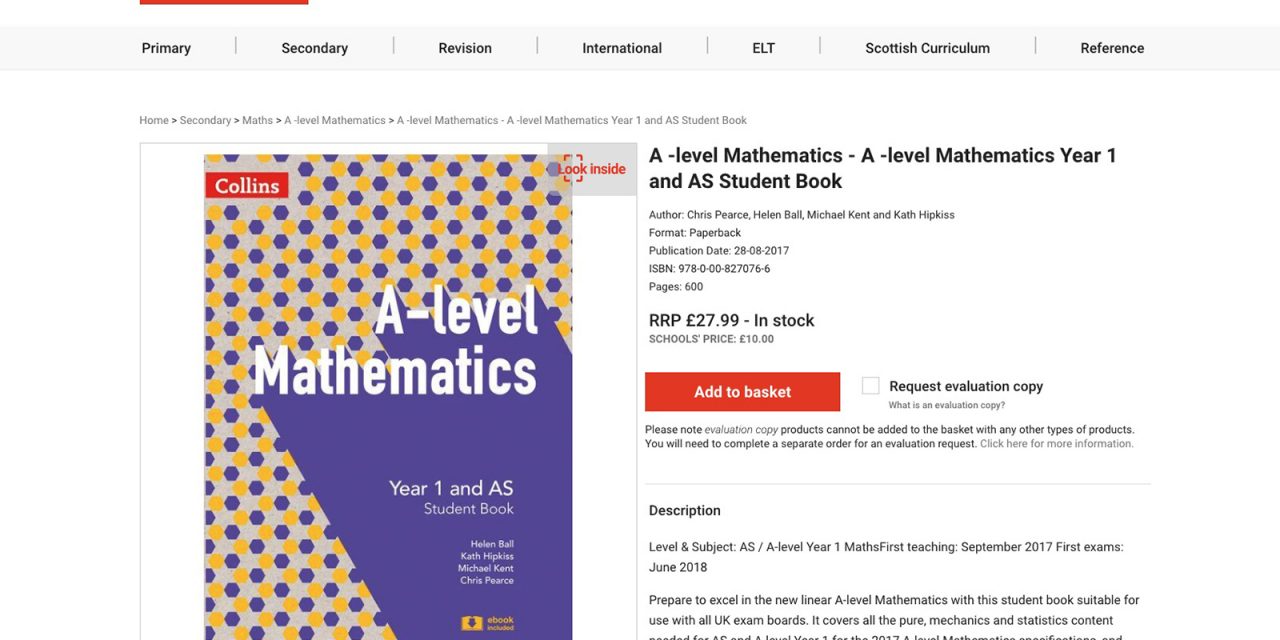
Each product can have multiple statuses (pre-publication, pre-order, available) along with multiple formats (teacher addition, digital download) and many textbooks can be opened and the first few pages viewed online.
With all these products and variations in mind, we distilled all this information down into 4 product page templates, allowing HarperCollins to update and manage their product catalogue easily.
It was key during the design phase, that all the information was available and easy to ingest, however, did not interfere with a customer purchase journey. This also included recommending correct relevant products to help increase AOV.

We focused on presenting the information clearly. The add to cart button is really clear, so what stage the product is (coming soon, pre-order or buy) and the amount needed. Due to the complexity of the checkout, we needed to provide friendly yet clear error messaging for those purchasing evaluation copies. We made sure we backed up that same information at checkout so it was never missed by a user.
Custom Checkout:
The Collins Learning site has two target audiences, parents and teachers, and each is allowed to purchase is slightly different ways. Teachers are allowed to purchase evaluation copies for their school and allowed to purchase bulk amounts textbooks at a lower rate. Both target audiences can use different payment methods, parents or guardians can use PayPal or credit cards, whilst schools must use either a school registered credit card or school account.
The HarperCollins project involved serious logic and allowing different types of customers to access the same product (or product variations) in different ways. We really pushed the technical boundaries of Shopify Plus to allow evaluation copies to be purchased and created two strict purchase journeys for the two key markets.
Read more: wemakewebsites.com


