
[ad_1]
Careful attention to CTA (call to action) copywriting is the difference between brands that drive conversions and those that only drive traffic.
Brands that slap a “Buy Now” button on a page and call it a day wonder why their campaigns fail to convert. Companies that engage in strategic CTA testing continue to drive success metrics like CTR (click-through rate) up and to the right.
CTA testing is paramount because it’s not always obvious what needs to happen for your business. Landing page platform Unbounce boosted conversion rates by 90% by changing their CTA copy from “Start your 30-day trial” to “Start my free 30-day trial.”
In this article, we’ll explore seven powerful CTA examples from high-performing companies. You’ll learn what makes them so convincing so that you can apply these lessons in your own CTA writing.
What is a call to action in writing?
Your call to action is the prompt you give readers or users to take a desired action.
That action might be to:
- Download an ebook or guide;
- Sign up for a free trial;
- Register for an upcoming webinar;
- Browse products in your online store;
- Book a sales demonstration.
CTAs are a critical component of marketing material. It’s the point where you tell your reader to do something.
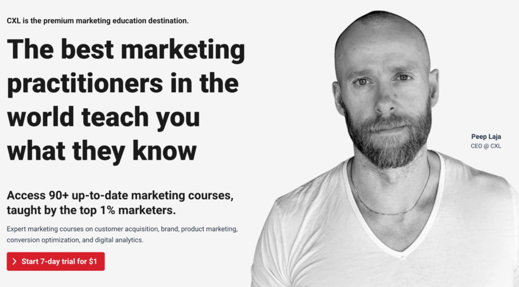
CXL use them on landing pages to invite customers to trial top marketing courses:
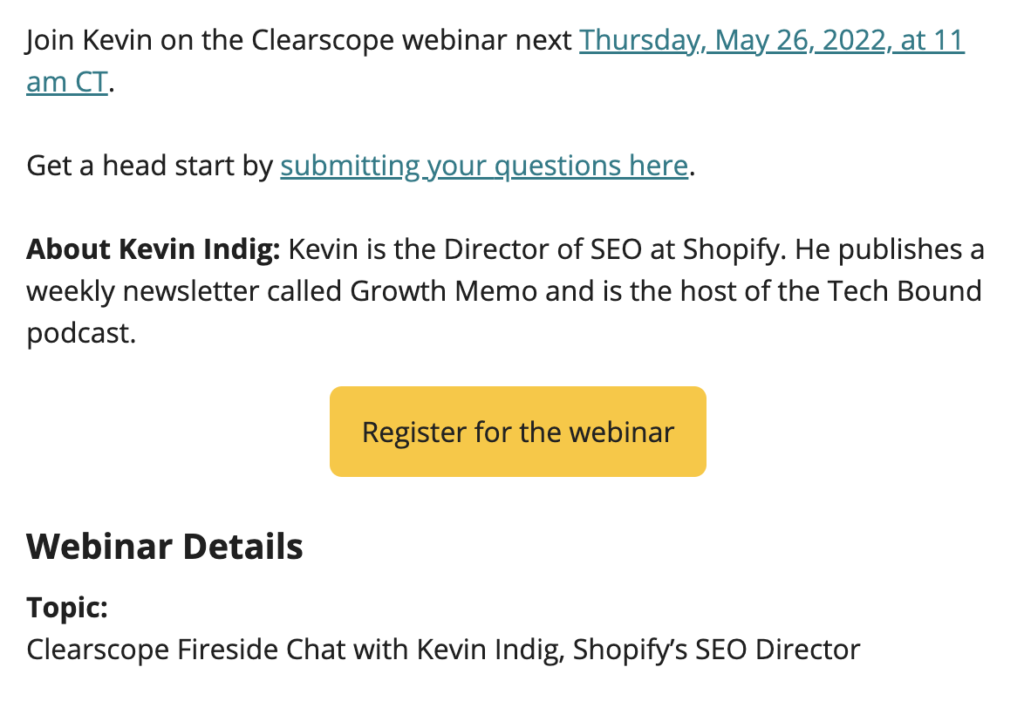
SEO tool Clearscope invites users to join their Director of SEO in a webinar.
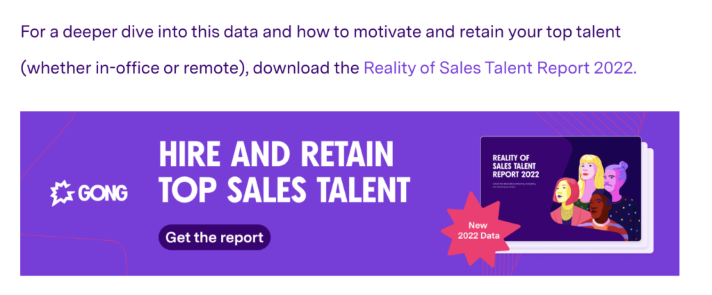
And revenue intelligence platform Gong uses CTAs at the end of blog posts to guide readers to additional content they may find valuable:
At the most basic level, these CTAs exist to give customers their next step in the buying journey.
CTAs drive the buying journey
A CTA in a brand awareness campaign will look entirely different from a CTA meant to drive sales at the bottom of the funnel.
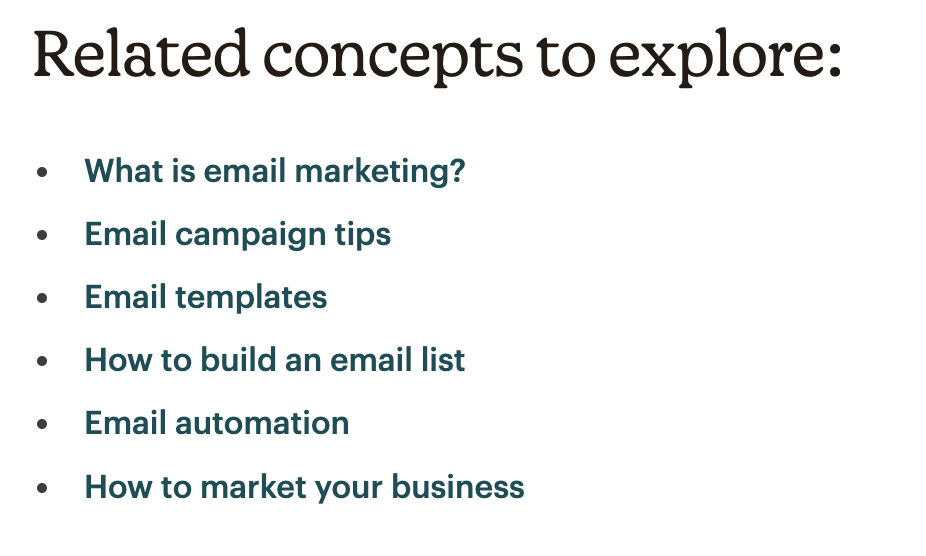
Take this post from Mailchimp on email marketing benchmarks. Most readers will land on this page after searching for “email marketing benchmarks” on Google.
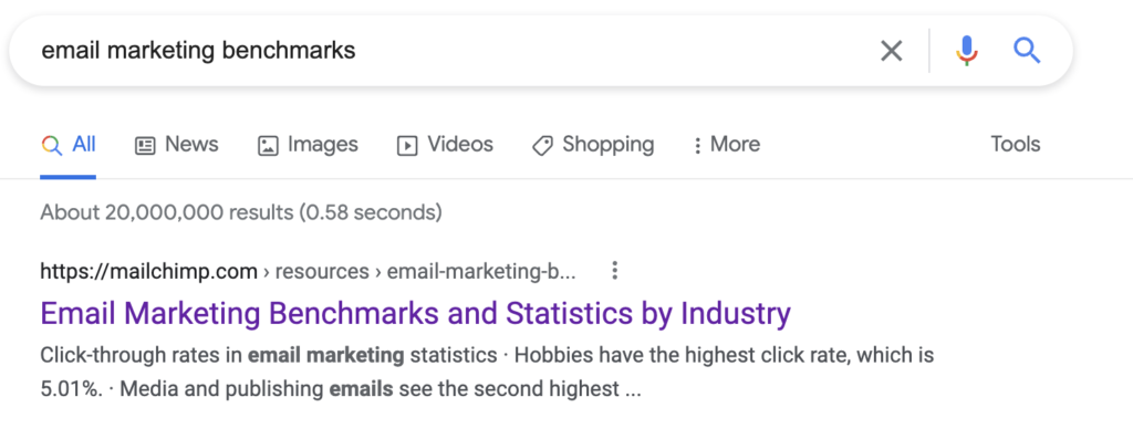
Mailchimp knows, then, that the user’s search intent is to learn more about the subject of email marketing, not about Mailchimp and its features.
So, the CTA at the bottom of this blog post directs readers to related concepts, several of which are more prescriptive and action-focused than email marketing benchmarks (a powerful way to build value for the customer and to establish your brand as an authority).
Strong CTAs go beyond “buy now”
The traditional answer as to why CTAs are important is that “customers don’t take action unless they’re told what to do.”
While this is true, it’s not the whole story. A strong call to action doesn’t just provide a path forward but removes any barriers or objections.
Consider the CTA “Sign up now” on a SaaS product landing page. This raises several buyer objections:
- Do I have to pay?
- How much does it cost?
- Am I locked into a contract?
- How long is the contract?
- What payment methods are available?
Effective CTA writing can overcome these objections simply by altering the wording.
Copper uses the copy “Try Free” to preempt and solve these objections.
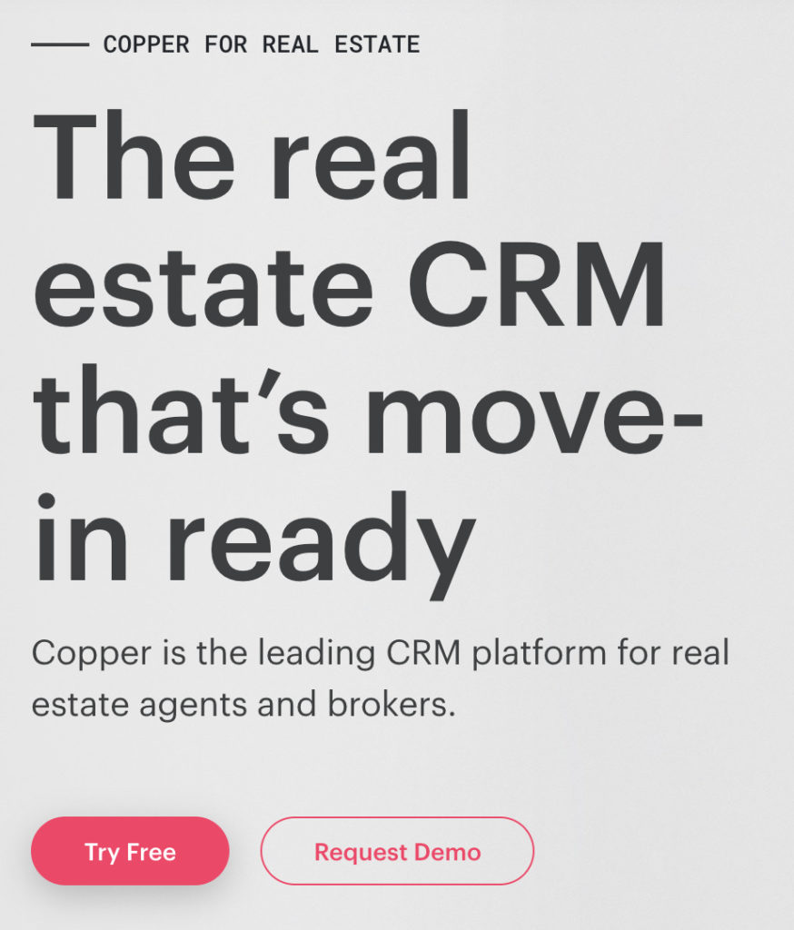
The word “Free” eliminates any concerns about cost, and the addition of the term “Try” implies a trial period, so there is no risk of signing up for a lengthy contract.
How to write a call to action that converts
CTA writing is a form of persuasive writing. Your goal is to convince readers to take a given action in as few words as possible.
A strong understanding of buyer psychology and buyer intelligence will be helpful here. You can also fast-track results with these CTA writing techniques.
Use Voice of Customer research to understand buyer goals
Voice of Customer research uses qualitative and quantitative research to uncover the wants and needs of buyers in their own words.
Then, you’ll use these insights verbatim (or close to) in your marketing material to resonate with customer desires.
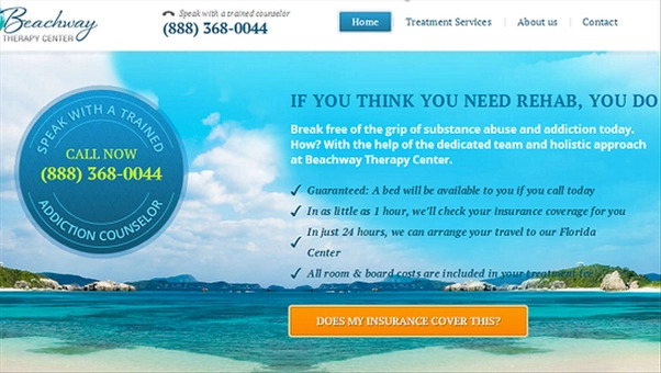
This is how Copyhackers wrote Beachway Therapy Center’s landing page to drive 400% more click-throughs on the CTA.
The group mined Amazon addiction book reviews to learn about wants and pains and note memorable phrases.
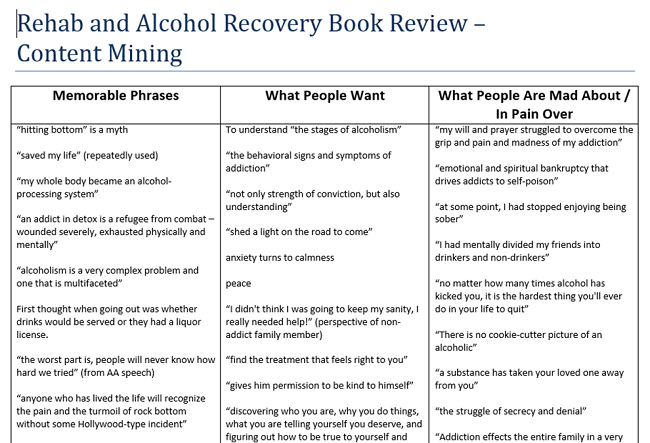
Within those reviews, they caught recurring themes and identified the messaging that resonates with their customer base. The group then applied that copy to the landing page.
Messaging strategy agency Make Mention learned that the CTA for their client, “Start with the first hour free,” was asking for too much too soon.
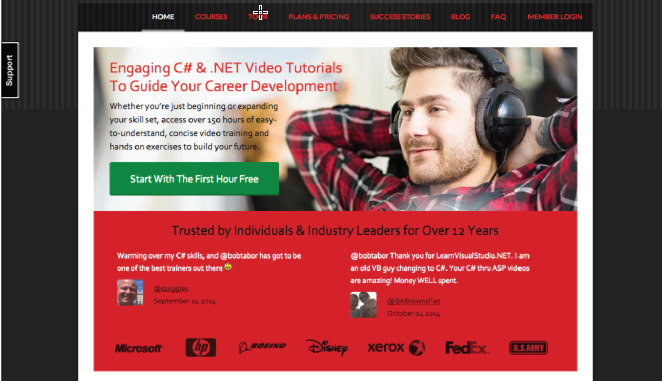
The group conducted online and email surveys and learned that users struggled to understand the course’s value and encountered friction because objections weren’t addressed.
Make Mention redid the page, injecting several phrases from the customers’ vocabulary, including:
- “C#”;
- “.NET”;
- “practical exercises”;
- “getting your first developer job.”
They also directed the CTA button to lead to an alternative page where customers can learn more about the course.
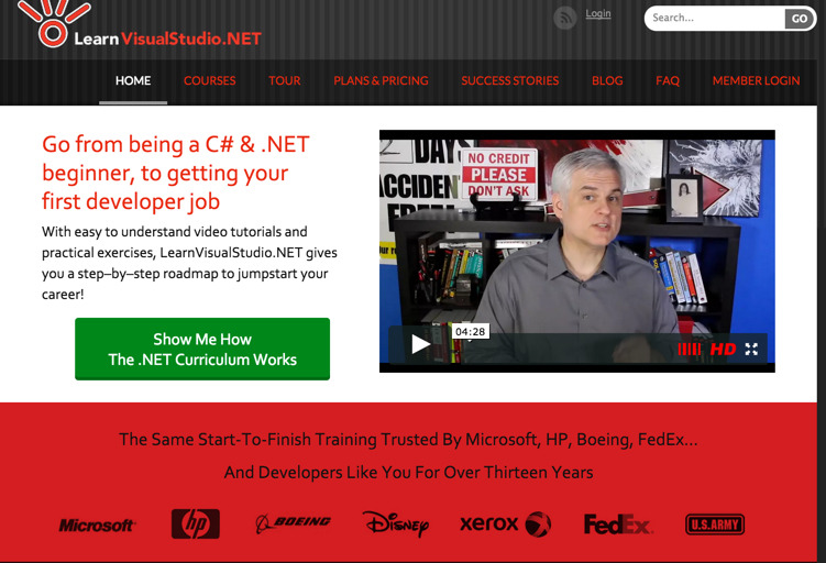
Make Mention helped customers get more information before asking for the sale, and critically, they used the language customers use. This tweak boosted conversions on the CTA button by over 66%, leading to more check-outs from the Curriculum page than the Pricing page.
Start with an imperative (command verb)
A good general rule to follow in CTA writing is to always start with an imperative. Imperatives are action words; they tell the reader to do something.
Powerful examples of action phrases include:
- Start;
- Add;
- Call;
- Try;
- Get;
- Learn;
- See;
- Explore;
- Click;
- Find;
- Join;
- Order.
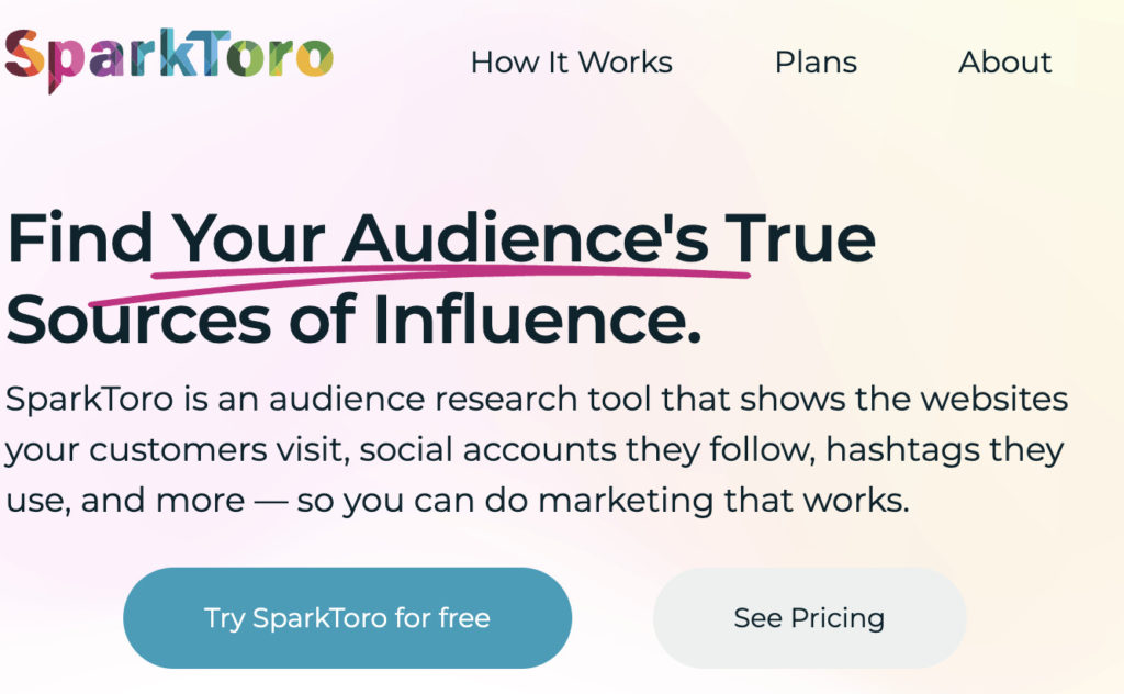
SparkToro demonstrates two examples of imperatives in action with their buttons: “Try SparkToro for free” and “See Pricing.”
Preempt and eliminate objections
Effective call to action writing preempts objections and eliminates them early.
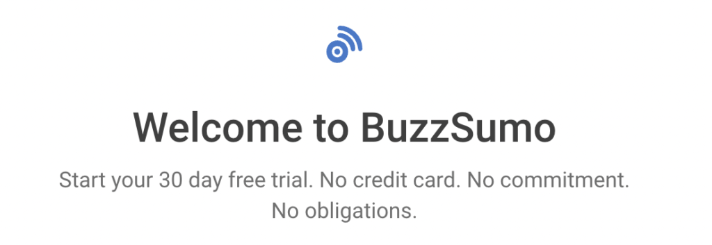
Take Buzzsumo, which clarifies that new users don’t have to pay a cent for 30 days, obliterating worries about forgetting they’ve started the trial and purchasing accidentally.
The most common objections you’ll face are:
- Cost (Is there one? And if so, how much?);
- Time (How long is this going to take?);
- Commitment (Am I locked into anything?).
For cost objections, use terms like “free” and “no credit card required” to clarify that there is no cost involved.
For time objections, phrases like “instantly,” “in 2 minutes,” and “now” communicate that the action will take place quickly.
Solve commitment objections by clearly outlining the trial length (“Try free for 14 days”) or with terms like “free forever” and “no credit card.”
Leverage power words to build excitement
Command words tell readers what to do. Power words make them feel excited about doing it. Combining the two is what motivates users to take action.
Examples of convincing power words to use in your CTA writing include:
- Deadline;
- Instantly;
- Quick;
- Reduced;
- Surge;
- Classified;
- Minimalist;
- Irresistible;
- Effortless.
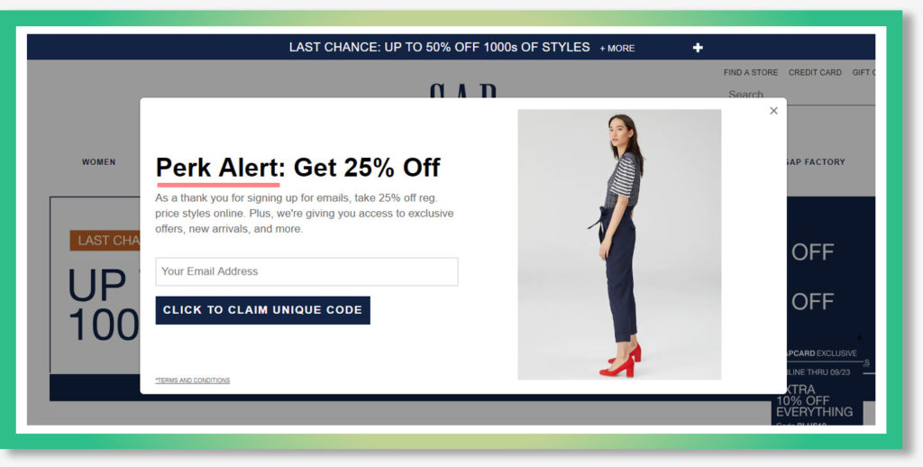
For example, GAP uses the term “unique” to encourage users to sign up for their mailing list (in exchange for a 25% discount).
Create a sense of urgency to inspire immediate action
Great call to action writing inspires readers to take action now. When done well, they create buyer FOMO (fear of missing out), motivating website visitors to act immediately.
Words like “now,” “instantly,” “limited time,” and “today” are a good starting point but are best supplemented with urgent imperatives like “seize,” “gain,” and “access.”
Youprenuer combines the imperative “Get” with the urgency-building power word “Instant” to build a compelling CTA for their email list.

Use mystery to generate curiosity
In certain cases, you’ll want to avoid mystery altogether. For instance, when crafting a CTA designed to motivate readers to sign up for a free trial, we want to clarify what customers are getting into.
But curiosity can work in our favor for downloadable content like ebooks and guides.
Terms like “discover,” “see what’s inside,” and “get the secrets” are powerful curiosity-builders that can help motivate readers to hand over their email addresses in exchange for the promised value.
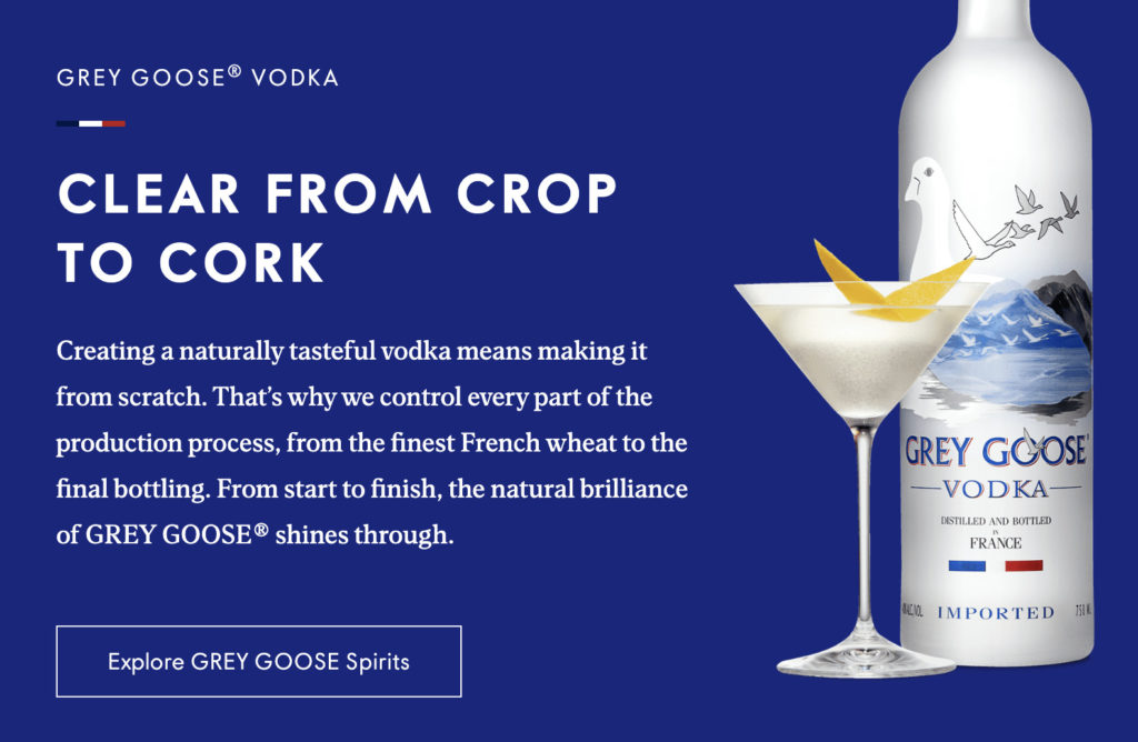
“Explore” is a great example of a curiosity-building word to include in your CTAs, as demonstrated by premium vodka brand Grey Goose.
Back up your claims with social proof
CTA copy doesn’t need to sit on its own.
Great CTA writers supplement copy with social proof (testimonials, reviews, logos) to give more gravity to their message and build trust with skeptical buyers.
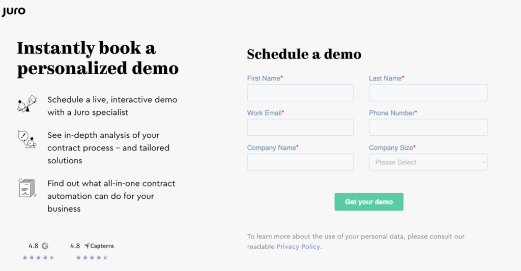
Juro, for example, supplements their “book a demo” CTA with review ratings from Capterra and G2.
7 impressive calls to action (and why they work so well)
Ultimately, A/B testing and experimentation will help you uncover your purpose’s perfect call to action.
Use these examples as a jumping-off point, and tweak and test as appropriate.
1. Pipedrive removes barriers to conversion
One of the biggest factors preventing readers from converting is the unknown. When faced with a CTA like “Start now,” customers wonder internally:
- What’s involved in starting?
- Do I need to get my credit card out?
- What exactly am I committing to?
You can solve these objections before they arise with careful copywriting.
Pipedrive’s homepage CTA section is a powerful example of this.
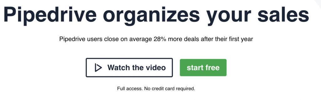
The green “Start free” call to action button immediately tells readers there’s no cost involved. The supplementary “No credit card required” copy below also helps users overcome this objection.
The addition of the simple “Full access” answers the question, “But am I just signing up to a limited version, and will I need to pay to access more sophisticated features?”
Lastly, Pipedrive does a great job of communicating why readers should click that CTA button (because Pipedrive users close 28% more deals after their first year using the CRM).
Takeaways from Pipedrive’s CTA example:
- Incorporate terms like “free” and “no credit card” to solve cost objections;
- Make it clear to users what they’re signing up for (e.g., full platform access);
- Use compelling social proof to communicate the why (answer the question, “What’s in it for me?”.
2. ActiveCampaign makes it clear what customers are signing up for
Average CTA writing leaves readers guessing:
- What am I signing up for exactly?
- What happens next?
- What if I don’t like what I see?
- Am I going to get hounded by a sales rep?
Strong CTA writing makes a reader’s next steps abundantly clear.
Take ActiveCampaign.
The exit popup on their email marketing product page aims to capture a reader’s interest (and email address) before they leave ActiveCampaign’s site.
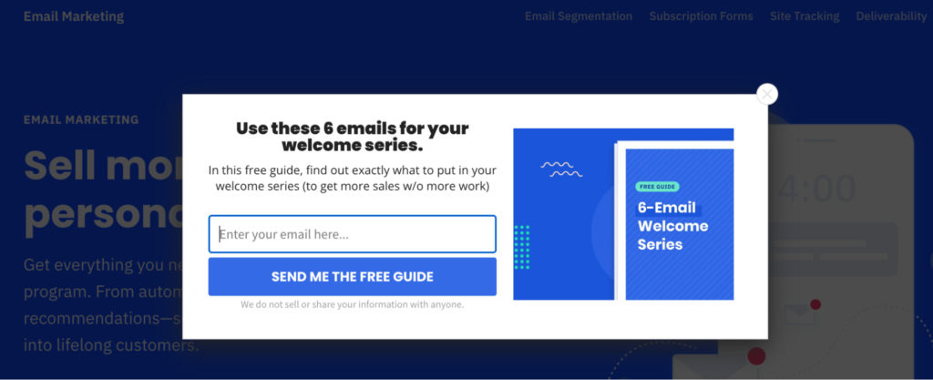
A simple “Download our guide” wouldn’t be sufficient. Those who leave a landing page without clicking an in-page CTA are clearly unconvinced, so any copy in an exit popup must be especially persuasive.
ActiveCampaign nails this in their header copy.
“Use these 6 emails for your welcome series” tells readers precisely what they’ll receive.
The use of the term “free” in the body copy eliminates cost objections, and the addition of the bracketed “to get more sales w/o more work” puts the offer in the context of the result, answering the reader’s question, “What’s in it for me?”
“Send me the free guide” (the copy in the CTA itself) is reader-focused (written in first person) and reiterates that there’s nothing to lose as the guide is free.
Lastly, the copy below the CTA button (“We do not sell or share your information with anyone”) works to convince even the most skeptical reader that they’re signing up for a safe offer.
Takeaways from ActiveCampaign’s CTA example:
- Make it abundantly clear what readers are going to receive;
- Solves the cost objection by doubling down on terms like “free”;
- Put your offer in the context of results (answer “What’s in it for me?”);
- Assure readers that their personal information will remain anonymous and won’t be sold or shared.
3. Wordable talks results
Vague, convoluted statements (“Helping ambitious creators design better futures”) don’t convert.
Concise, solution-focused calls to action that speak directly to outcomes (in your customers’ language) do.
Take Wordable, a platform that connects Google Docs with WordPress, HubSpot, and Medium, allowing high-volume content producers to publish to their blog in seconds.
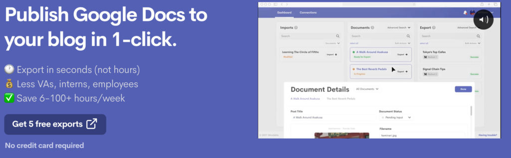
Wordable doesn’t waste time telling readers how they’ll “Streamline and transform their content operations processes.” Instead, they jump straight to results:
- Publish in just one click;
- Export in seconds rather than hours;
- Cut back on VA or employee costs;
- Save as much as 100 hours per week in publishing time.
Then, Wordable delivers a persuasive offer, five free exports (notice the imperative “Get” kicking off the CTA copy), and eliminates any commitment objections by including the phrase “No credit card required.”
Prospects who read this CTA (and accompanying copy) aren’t left wondering what Wordable can do for them. They know exactly what problem it will solve and the results they can expect from hitting that CTA button.
Takeaways from Wordable’s CTA example:
- Speak your customers’ language (and avoid convoluted, vague, jargon-filled copy);
- Get straight to the results (What outcomes can your customer expect?);
- Back up “free” usage claims and solve commitment objectives by not requiring a credit card.
4. Jasper speaks directly to a common pain point
Though actual figures are hard to come by, marketers estimate that the average consumer sees between 4,000 and 10,000 ads per day.
Unsurprisingly, users see a large chunk of these ads (33%) on social media platforms.
If you’re going to stand out from the other 3000+ ads your audience sees on these sites, you need to connect directly with their most critical challenges.
Take Jasper, an AI copywriting assistant.
Jasper’s Facebook ad speaks directly to a target audience pain point: content marketing is a time-consuming, labor-intensive process.
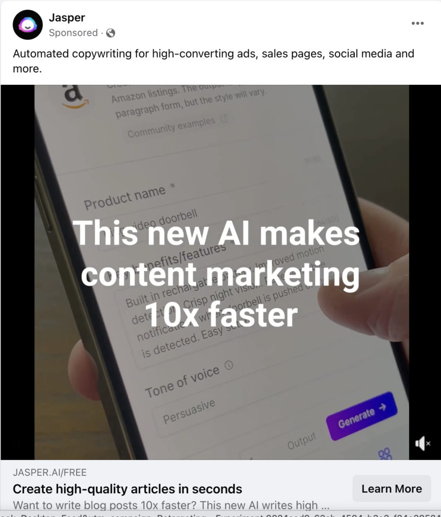
The video used in this digital ad is effective in and of itself (it shows the product in action, overlaid with a simple message “Write 10x faster”), but the copy below is what makes this a good CTA example:
“Create high-quality articles in seconds.”
First, Jasper begins with the action verb “create” before describing the desired outcome (high-quality articles) and the compelling benefit of their product (in seconds).
In just six words, Jasper communicates how its platform solves a common challenge for ecommerce site owners, social media managers, and digital marketing professionals.
Takeaways from Jasper’s CTA example:
- Identify a pain point that resonates with potential customers;
- Communicate how you’ll solve that pain point (i.e., your value proposition);
- Describe this benefit concisely, putting the reader as the subject.
5. Emma builds intrigue by keeping it concise
Often, the best call-to-action examples are those that are concise. This is an especially powerful technique when writing CTAs designed to promote downloadable content such as guides, ebooks, and checklists, as it can double as an intrigue-builder.
Take email marketing platform Emma, whose simple CTA “See How” is a compelling example of how much you can achieve with just two words.
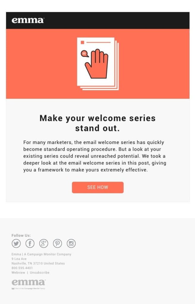
Of course, this CTA is only effective in the context of what you’ve said before:
- Your email marketing campaigns can be better (probably);
- We’re going to give you a framework for improving them.
This is an intriguing proposition (readers are asking, “Can I get more from my existing email list?”).
The call to action “See How” builds on this intrigue, inviting readers to click through and answer the question themselves.
Takeaways from Emma’s CTA example:
- Introduce a common problem;
- Imply that you’ll help readers solve it;
- Keep your CTA copy short and sweet to leverage that curiosity.
6. BetterHelp solves three objections in just three words
Skilled CTA writers understand how readers will respond to an offer and what objections or roadblocks will appear to prevent conversion.
Then, they address these objections directly in their copy.
Take BetterHelp, an online therapy platform that uses social media advertising in its demand generation strategy.
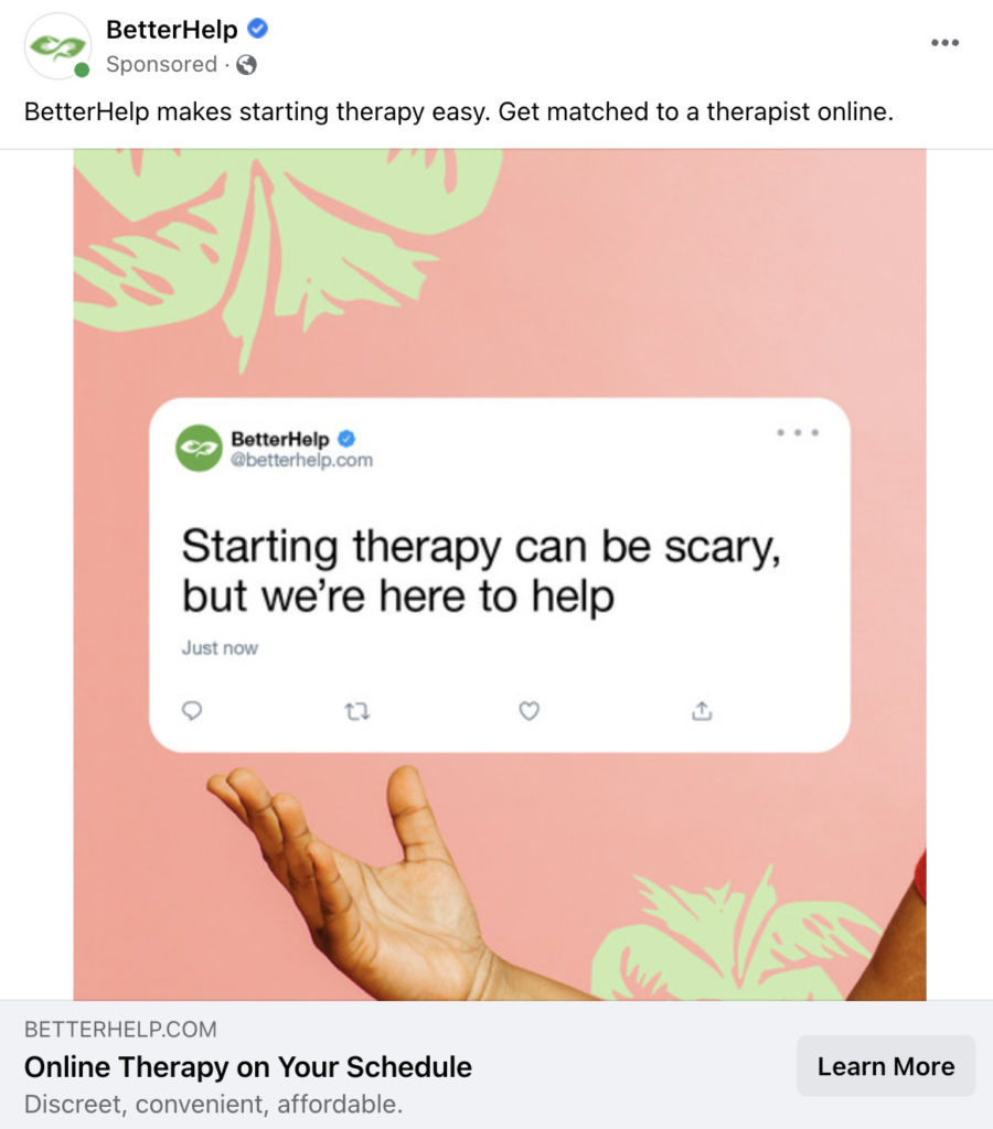
The intention of the above ad isn’t to convert readers into paid subscribers. It’s simply to convince ad viewers to click through to BetterHelp’s website and learn more about their product.
But, BetterHelp knows that while this is a low-commitment ask, prospective customers will have many concerns:
- What will others think if they find out I’m using online therapy?
- I’m busy. I don’t think it will fit around my schedule.
- Isn’t therapy usually super expensive?
BetterHelp solves all three objections using just three words:
- Discreet (Nobody will even know I’m using BetterHelp).
- Convenient (Therapy appointments are flexible).
- Affordable (BetterHelp is more cost-effective than traditional therapy solutions).
In this example, these three words supplement the actual call to action copy, “Online Therapy on Your Schedule,” reiterating that BetterHelp’s therapists are flexible about appointment times.
Takeaways from BetterHelp’s CTA example:
- Put yourself in the reader’s shoes: What concerns might they have that could prevent them from converting?
- Ask: What can we communicate that would quell these concerns?
- Test: What’s the best word (or phrase) to communicate that with as few words as possible?
7. ClickUp backs up its claim with a compelling guarantee
Convincing calls to action often make impressive claims.
But today’s consumers aren’t easily convinced, so if you make bold claims, be prepared to back them up.
Take ClickUp, which guarantees new users will save one day every week.
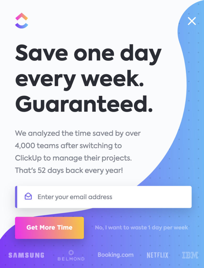
That’s a big promise, but ClickUp backs it up by providing context to their claim (we analyzed over 4,000 teams) and supplementing the popup ad with several impressive logos (Samsung, Netflix, IBM.)
But the real winner here is ClickUp’s CTA copy.
“Get More Time” is all about the result. It’s not about what ClickUp wants (“Sign up today”). It’s about what the customer needs.
Takeaways from ClickUp’s CTA example:
- If you’re going to make a bold claim, be prepared to back it up;
- Use customer logos as social proof to back up such statements;
- Frame your CTA copy from the customer’s perspective, not yours.
Conclusion
These call-to-action examples are a solid starting point for designing high-performing CTAs that resonate with your own audience. What works for these brands may not work for yours, so it’s always better to hypothesize and test.
CTAs that convert at high rates come from strategic experimentation. This is the only way to determine whether the word “Get” performs better than “Sign up” or “Access” for a given call to action. And it’s one of the best ways to see real business growth.
Check out our A/B testing tutorial today, and become a CTA testing pro.
[ad_2]
Source link

![How to Create Google Ads in GetResponse [Feature Update]](https://wildfireconcepts-media.sfo3.digitaloceanspaces.com/2022/11/how-to-create-google-search-ads-getresponse-440x264.png)


