
[ad_1]
Are your emails optimized for Dark Mode? If not, you might be neglecting a significant portion of your subscribers. Recent statistics show that over 35% of subscribers using Apple email clients open their emails in Dark Mode. This means that if your emails aren’t optimized for Dark Mode, you could be leaving your subscribers in the dark.
But fear not! In this blog post, Hannah Tiner (Email Design and Production Specialist, Litmus) shares essential tips and tricks for beginners to create Dark Mode optimized imagery.
 |
Hannah Tiner (she/they) Email Design and Production Specialist, Litmus |
Read on—or jump ahead:
Step 1: Understand the basics of Dark Mode
When it comes to Dark Mode, it’s important to note that each email client handles it differently.
There are three default ways Dark Mode can render:
- No color changes. The design of the email stays the same, regardless of the UI being set to Dark Mode or Light Mode.
- Partial color invert. Inverts detected light backgrounds.
- Full color invert. Inverts areas with detected light backgrounds while also impacting dark backgrounds.
Read more: Ultimate Guide to Dark Mode →
Let’s look at examples of each:
Not a fan of the default color schemes? You can apply your own Dark Mode styles.
How to target email clients for Dark Mode styles
Not all email clients allow you to customize Dark Mode styles. But for those that do, there are several methods ways to target them via CSS:
@media (prefers-color-scheme: dark)[data-ogsc]
As you think through your email design and imagery, familiarize yourself with which email clients allow you to apply your own Dark Mode styles—and which don’t. Tip: keep this support chart handy for reference.
Other important considerations: Designing for Dark Mode
There are several other factors to consider when designing for Dark Mode. Hannah says:
- Make sure you’re designing for clients where you can’t force Dark Mode. You have the least control over these clients, so you’ll want to to prioritize adapting your imagery and colors so it sticks to your brand guidelines.
- Structure with progressive enhancement in mind. Create a minimal viable product (MVP) that looks clean, functional, and will get the job done. From there, you can add progressive moments of surprise and delight for your subscribers.
- Planning for least control vs. planning the most. Know where you can push boundaries and where you need to play it safe.
Now that we have groundwork covered, let’s dive into design components.
Step 2: Determine styles and variations for design components
As for design components, you have a couple of stylistic options to go with:
To determine which route to go with, Hannah’s recommends you first ask yourself:
| Is it more important to retain the look and feel of the graphic? Or is to more important for it to be transparent? |
If the answer is look and feel: consider placing it on a background and flattening the image.
If the answer is transparent: use a glow or stroke to help your imagery standout in Dark Mode.
Here are a few techniques with guidelines to try in your emails:
Technique 1: Design with midtones
One approach is to focus on midtones, while accounting for accessible contrast ratios.
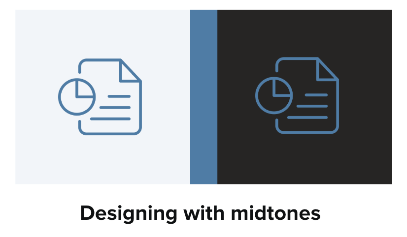
When designing with midtones, use a color that has a high enough color contrast for both white and black because it falls toward the middle of the value range.
Technique 2: Use a glow or a stroke
A glow or solid white stroke around an icon or logo can also help with readability, but it depends on the type of image or icon.
For transparent PNGs with dark text, adding a translucent glow works great. Here’s an example of our logo:
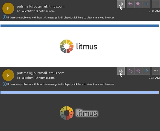
Using a glow effect works better for some icons than others, though.
Technique 3: Use a shape outline or background
For stroke-based icons and illustrations, Hannah recommends you try adding a shape outline or background shapes behind them for a more visually appealing look.
![]()
![]()
“I personally find glow effects a bit hard to read visually so I prefer technique 3: putting the icon on a background for a cleaner read. That way it looks transparent on Light Mode and still works in Dark Mode where you can’t swap the image,” says Hannah.
Step 3: When it comes to animated GIFs opt for APNGs
Instead of using GIFs to add animation to your emails, try using Animated Portable Network Graphics (APNGs).
GIFs don’t support transparency well:

White outlines can become pixelated due to a limited color range. On the other hand, APNGs generally do support transparency and have a wider color range.
Interesting in giving animated APNGs a try? We cover that here. (Pro tip from Hannah: Give Fable a try for your next APNG!)
Embracing Dark Mode
Want more Dark Mode resources? Download our complete Dark Mode Toolkit as well as our new Dark Mode Coding Experience, now available in Litmus Builder.
[ad_2]
Source link


