Vidyard has a long history of creating Halloween videos. They are among our favorites when it comes to culture videos because of the creativity and anything-goes approach that comes with the holiday. Many of our past videos have been rooted in comedy and parody. But sometimes, you just need a good scare.
But to make a truly bone-chilling Halloween video, you don’t need a scary budget. Heck, you hardly need any budget. (The only thing we bought and used in the example below was a desk lamp for $3.99.)
If you haven’t seen “Unknown” yet, grab a buddy and watch it now, because there are SPOILERS ahead.
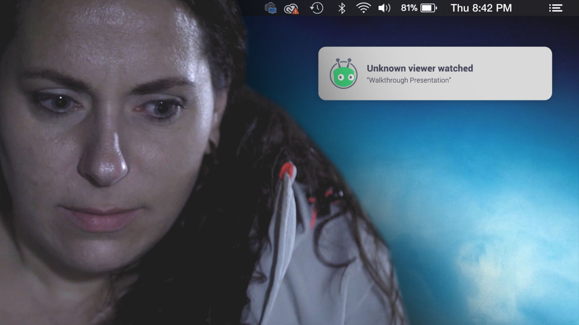
Our Horror Homage Halloween Video Concept
The video team sat down to brainstorm exactly what kind of scary movie we wanted to create. As a company culture video, we knew we had free range and weren’t limited to explicitly promoting our brand or demoing our product. We wanted to make an entertaining video for the sake of encouraging engagement and offering something fun to our existing audience base.
We thought about ghost stories, classic monsters, and even slasher flicks. In the end, we were inspired by the Swedish short film “Lights Out.” It was made on a shoestring budget and is certifiably terrifying. “Lights Out” was the breakout film for director David Sandberg who went on to direct “Annabelle” and “Shazam!” in Hollywood.
We all agreed that “Lights Out” had a particularly lingering effect because it was based on the universally scary concept of being alone in the dark. In it, a woman notices a dark figure within her apartment when she turns off the lights. No matter what she does, she can’t avoid it—until it’s too late. The short film is instantly relatable and gets straight to the point, which is to frighten and entertain.
One of the most talked-about aspects of this viral short film was that it was created on a shoestring budget. Lighting and practical effects carried the weight of the scare factor. We wanted to do that too.
Our second inspiration was “Black Mirror” and the show’s use of technology to explore a strange and potentially dangerous future. As a video hosting software company, our technological fear factor was obvious.
If you’ve used Vidyard’s Chrome extension, you know that you receive a notification as soon as someone views your video. We imagined a scenario in which our main character (played by our talented co-worker Jennette) creates a video that lands in the wrong hands. Our software doesn’t actually let this happen, but please indulge us and suspend your disbelief.
We took this concept and ran with it to write a sparse script, that relied more on the quiet space between lines than the dialogue itself.
How to Make a Scary Video: Our ProcessEquipment
At Vidyard, we’re fortunate enough to have an in-house video production team with access to all the basic equipment needed to turn this nightmare into a reality.
These are the tools we had at our disposal:
Camera (Sony A7III Mirrorless camera, Metabones adapter for Canon Lenses)Lights (Ikan bi-color dimmable LED lights)Tripod (Manfrotto)Lav mic (Sennheiser G3)Slider (Cinevate Atlas)
As long as you have a camera (and that includes a smartphone camera), lights, and a decent microphone, you can make a video.
Storyboarding
When storyboarding our script, we drew heavily on scary movie tropes to create suspense and a feeling of unease.
Extreme close-ups punch in on important details like the alerts on our character’s computer screen.
Extreme wide shots highlight how alone our character is in this big, dark space. It also creates a feeling of voyeurism. Is she being watched?
The piece de resistance was our dolly zoom shot at the very end. (This one goes out to all the film nerds.)
We knew we wanted to try a dolly zoom because it’s one of the most classic in-camera effects used to make audiences feel unsettled. Popularized by Alfred Hitchcock in Vertigo, the dolly zoom involves zooming out with your camera lens to affect the angle of view, while simultaneously pushing the physical camera body forward on a dolly (or vice versa). We used a slider instead of a dolly, and if you don’t have either, you can use a skateboard or something similar that will move smoothly while supporting your camera.
The result is a stomach-turning, field-of-vision warping as seen in Jaws.
Scary movies are so much fun for filmmakers because they’re a free pass to break the rules of cinema to achieve the desired effect. I’m talking about dutch angles (off-kilter camera angles), shaky or handheld camerawork (like in the Blair Witch Project), and crossing the axis. That’s the imaginary line that directors use to orient viewers within the space of the scene. It’s usually a big no-no to cross it, but if used intentionally, it can produce disturbing results.
Screen Inserts
An important piece of the puzzle to making “Unknown” believable was the Photoshopped screen views of Slack, Zoom, email, and phone notifications. It’s possible to add screen inserts to your video in post-production, but in this case, we chose to have them on screen for the actual shoot. Our creative director Blake Smith explains, “I chose to create the inserts and have them [on device screens] during the filming was to avoid breaking the reality of the story. It also helped our talent during the acting process.”
The Best Lighting for Scary Movies
Light, and often lack of light, can be used in some very creative ways within the thriller and horror genre. For example, The Blair Witch Project is known for its distinct lack of light. The darkness limits visibility for the viewer, putting them in a similar position to the characters. Missing information puts people on edge. On the other hand, 2019’s Midsommar takes place on a bright sunny day. The bright light and use of color reinforce the theme that something truly evil can lurk underneath a cheery facade.
We wanted to keep our set as dark as possible to sell our theme. We had three dimmable LED panel lights available, but in most shots, we only used one or two of them. Otherwise, we relied on practical lights. The desk lamp (where our full budget of $3.99 was spent), was necessary to set a stark contrast between the warm tungsten glow and the darkness of the room. The stairwell light represents an escape from the darkness which gets closed when our main character chooses to investigate those mysterious video views (don’t do it!). And of course, the computer screen itself provided a blue light that went with our chosen dark color palette.
How to Pick Sound for a Scary Movie
Imagine Psycho without the screeching music in the shower scene. Or Jaws without the ominous “da-dum, da-dum.” They just wouldn’t be the same.
And it’s not only background music that sets the tone when making a scary movie. The Shining would be a lot less disturbing without the click-click of Jack’s typewriter or the rumble of the tricycle passing over floor and carpet. Video is nothing without sound.
Vidyard’s former Video Production Manager (and editor of “Unknown”) Mat King explains that creating a custom soundscape increases the emotion and drive of a scene. This includes basic foley, recorded sound to emphasize minor actions like typing, walking on gravel, and other actions that would produce noise in a normal setting. In fact, Mat says, “Almost all of the noises that we as viewers just naturally attribute with being a part of that sequence weren’t actually captured during the production.” Mat uses a stock library (like Artlist.io) to find his basic foley effects. You can record your own or purchase sound packs online where higher sound quality comes at a higher price.
The foley along with music drives the scene forward, especially in a scene with minimal dialogue. Mat created a droning noise with deep bass notes and high-frequency strings to create an uneasy feeling of tension.
Chose the Right Spooky Color for Production
Colour is another element that sets the tone of any video and can be especially noticeable within a horror movie. Cold blue is often used to denote an eerie or somber mood. Red is commonly used to foreshadow violence (Red Rum! Red Rum!).
The original 1977 version of Suspiria uses brilliant primary color tones to completely remove the story from reality. Master of horror John Carpenter is known for his strategic use of color. His 1982 film The Thing starts building tension with a muted palette of snow and ice, that becomes more and more saturated with rain as the action increases.
For “Unknown” Mat wanted blue to be the dominant color to enforce the cold feeling that matches moonlight and computer screens. He shot the video in-camera with a correct white balance knowing that he could refine the colors in post.
Make Your Own Scary Video
Halloween is the perfect opportunity to get your feet wet with video creation. Whether you go for comedy or horror, embrace your limitations and focus on crafting a great story.
Feel free to borrow techniques and tropes from movies you like and use them within your original story. Often a familiar trope can act as shorthand between you and your viewers. For example, a very wide, voyeuristic shot helps viewers quickly understand that your characters are being watched.
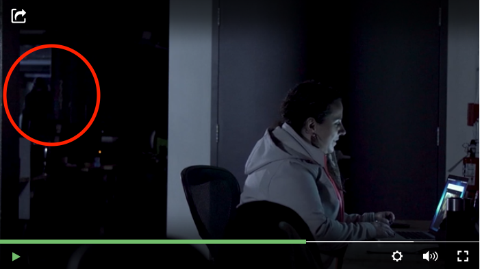
Before you go off and start creating your own awesome scary videos, I have to ask—did you spot see the dark figure in the background of “Unknown”?
Put Your Videos to WorkCreate, host, manage, and share your videos.Sign Up Free
This post was originally published on October 31, 2019. It was updated on October 20, 2021.
The post How to Make a Scary Movie with No Budget appeared first on Vidyard.
Read more: vidyard.com


![The 2019 Video in Business Benchmarks You Won’t Want to Miss [Infographic]](https://wildfireconcepts-media.sfo3.digitaloceanspaces.com/2020/11/1604725814-1-440x264.jpg)


