[ad_1]
Which of your pages is the most important to your visitors? To find out just pop open Analytics. Look at the pages report. They’ll all be there at the top. And there’s one page that’s sure to be in the mix:
It’s your About page.
Once you’ve filtered out those blockbuster blog posts, it will be there in the top 10 pages. It’s usually the top five. It’s true in virtually all Analytics accounts, or at least the 500+ accounts that we have access to.
And it’s no surprise. The About Us page is the page most likely to answer the big questions that visitors have about your brand.
- Who are the people who work here?
- What do these people believe?
 |
Emmily Soccorsy, Root + River“This reinforces what we know to be true about human behavior. We buy from people, not from companies. Visitors to your website are seeking to make a direct, heartfelt and human connection with the people we are buying from. When your website visitors go to your About page, they want to be moved, they want to feel something. They want to be connected to what you stand for.” |
If you doubt that your values are important to your visitor, look at the data from the Edelman Trust Barometer. It’s a global survey of 36,000 respondents in 28 countries, tracking trust and perception.
The research shows that now, more than any time in the 22 year history of the survey, customers, clients and job candidates all want to know your beliefs and values.
58% of respondents buy from brands based on their beliefs and values. And 60% of job candidates choose a place to work based on their beliefs and values.
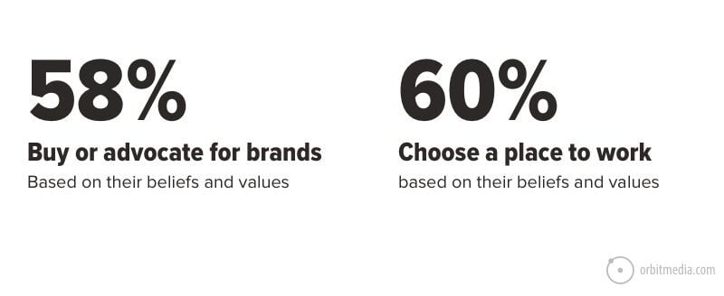
The message is clear. Your About page is a critical step on the path of your next prospect. It tells your story and answers key questions that are important to prospects and candidates.
So let’s look at the About page best practices. Like all web design best practices, they are guidelines, not rules. None are mandatory. Each of these aligns with an element of storytelling and each answers a specific question for the visitor.
Here they are on a little About page design template so we can see them all in one place.
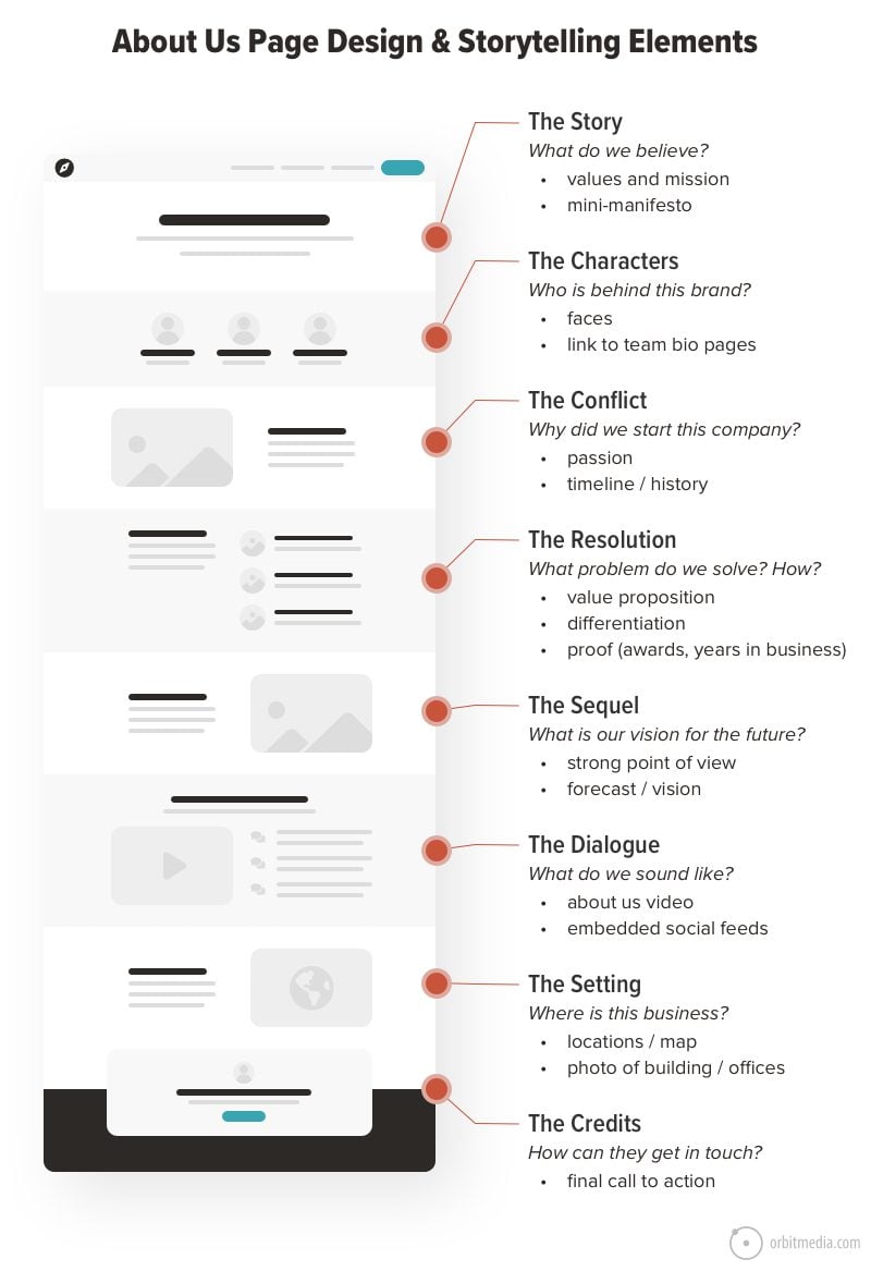
Before we break down these best practices in detail, let’s quickly look at some design and content considerations. These help answer the big UX question: How to design an About page?
Pick your navigation label
It’s always an item in the main menu. Common options for the label are About (or About Us), Company Profile, Our Story, Firm Profile. We’ve never seen a difference in clickthrough rates based on the website navigation label. They all basically convey the same thing: this is the page specifically about the brand and the people.
Single page? Or About Us section?
For many sites (this one included) the About content is more than one page. It’s an actual section, with a small set of pages, each addressing an about-related subtopic. This works well, but beware of “thin content.” There is no need to make a separate page for your mission if the mission is just 100 words. Don’t break up pages unless the pages are long.
Add visuals
There will be text of course. But the visuals are important. The About page is an excellent place for a video, which is basically an 8-minute documentary about the brand. This is also a key place to add visuals such as images of people and badges, like awards, certifications, memberships or other trust seals.
Forget about keywords
About pages are not a search engine optimization (SEO) opportunity because they aren’t keyphrase-focused. Unlike service pages and articles, which often target keyphrases, About pages don’t target a phrase other than the brand, and the homepage ranks for that.
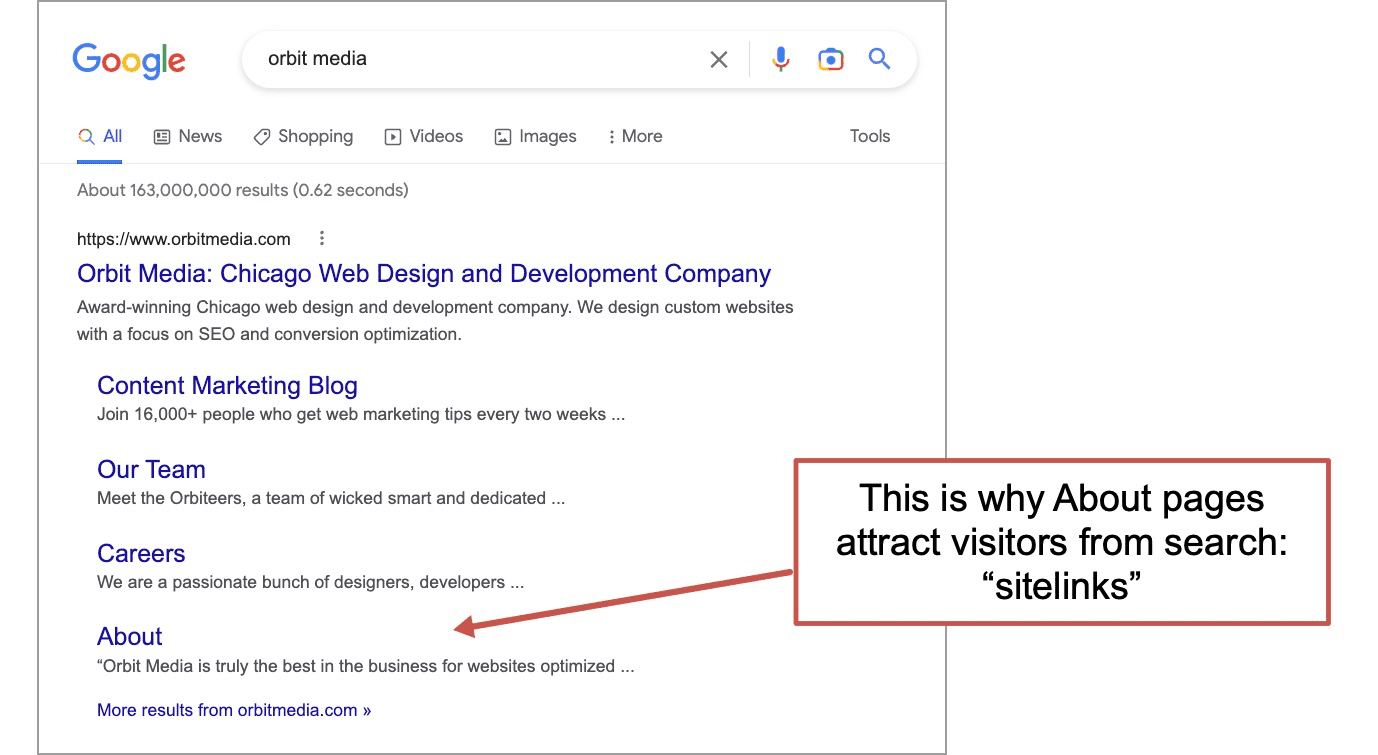
This doesn’t mean they don’t attract visitors from search. They often are landing pages, but not because they rank in the usual ways. Searchers land on them because of sitelinks, which are the additional links listed below a ranking URL in search results.
Look for schema opportunities
But there is still a small SEO opportunity: there are schema for About pages.
Schema are special tags that tell a search engine what kind of data it’s looking at. It’s a technical SEO thing. They’re added through a bit of programming. They improve how data is passed into Google which may help enhance search results or populate a knowledge panel.
About page schema include founder, specialty, audience, award, funder, offers and provider.
Add a call to action (CTA)
Your About page answers sales questions, like any service page in any web design. So it’s no surprise that the About page is on the path to conversion. With that in mind, it should have a call to action.
Although you could add a CTA button for email signups for content marketing, remember, this is a page for your potential customers and prospects. So it’s better to make the CTA for your primary offer, for lead generation.
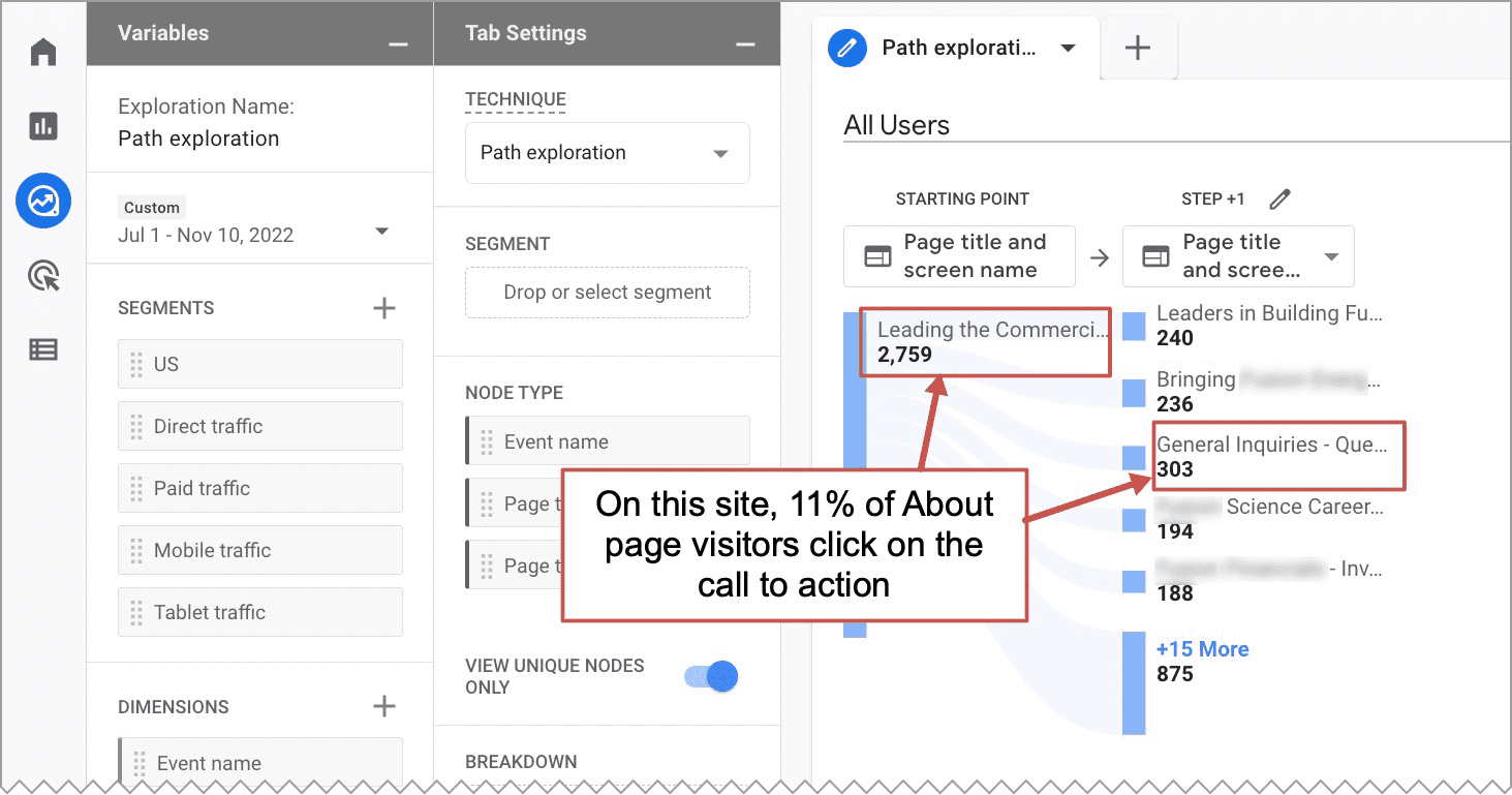
To prove that About page visitors convert into leads, check your Analytics. In Universal Analytics, the Navigation Summary of your About page shows the clickthrough rate on that CTA. It’s often very high.
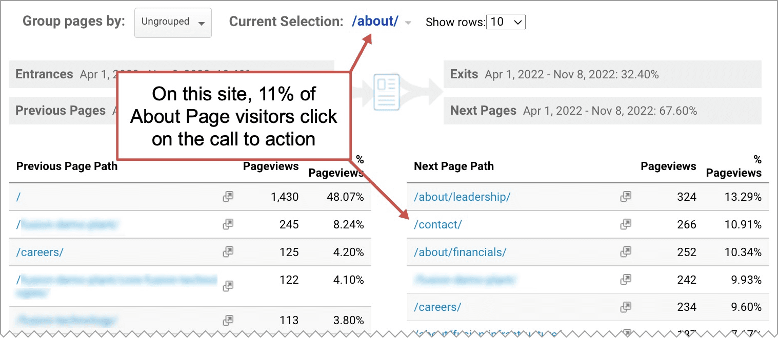
Here is the same analysis done in GA4, the new version of Google Analytics. A Path Exploration with the About page as the starting point shows the clickthroughs to every subsequent page. You can see that 11% of visitors to the About page go to the Contact page next.
Example About page CTA:
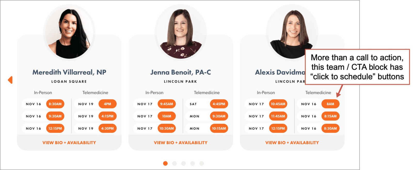
Innovative Care is a Chicago-based medical group, with a detailed About Us page. The call to action goes beyond typical lead generation. It actually allows the visitor to schedule an appointment, right there on the page. It’s an extraordinary feature that aligns with their core value of health care access.
Now that we’ve covered the About page layout considerations, let’s get back to the About page content. Let’s answer the question: How do you write an about page?
Here are seven questions that you can answer on your About page. Each question is aligned with an element of storytelling. The examples may help trigger ideas and inspiration. We’ve numbered these, but there isn’t necessarily an order. And several of these questions may be answered in a single paragraph.
1. Who is behind this business?
Story elements: Characters
The people are so important. You are one of the most important elements on your website. We recommend adding people to every page, but on the About page, people are mandatory. Many of your visitors came to the page to find you specifically.
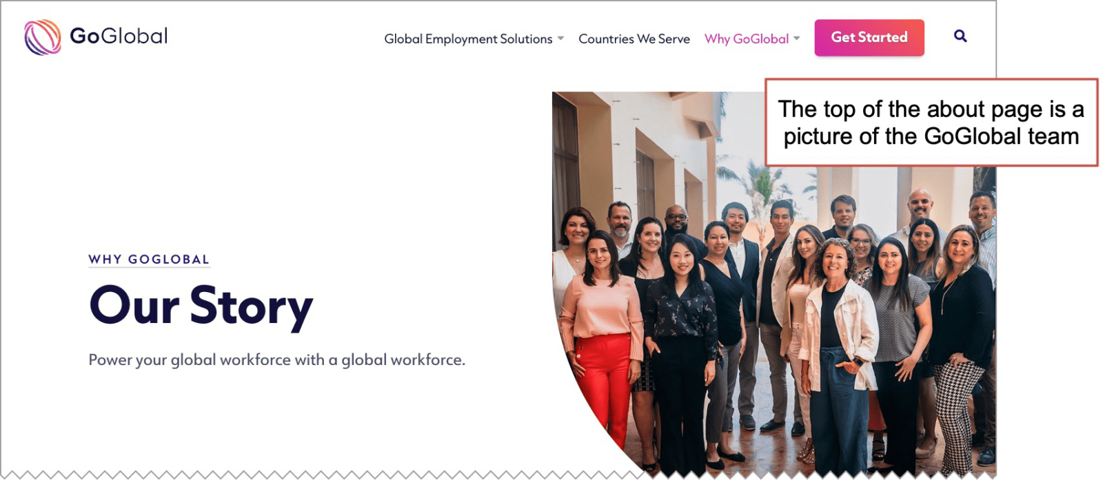
Example About page: GoGlobal is a global human resources company. Their site leads with the people, featuring a team picture at the top of the about page. It’s authentic. It’s differentiated.
Stories have characters. So introduce the team members. But the other key character in your story is your client. Here’s a good place to bring them into the story, even if only by naming your audience.
For visitors who want to learn more about specific people, create a page per person. This is a key to personal SEO and without it, you’ll never rank for the names of your team members.
Now that we’ve introduced our team, the story structure takes shape. But don’t overdo it. About page expert, Todd Jones, suggests keeping it simple.
 |
Todd Jones, Copyflight Media“About pages are great for telling your company’s story. But be careful. You might be tempted to use a complex formula. The Hero’s Journey is great for writing a movie. Not so great for an About Page. Keep your story simple. There’s no need to make your story fit into a complex formula that it may or may not already fit.” |
2. Why did they start this company?
Story elements: Conflict
Next you’ll tell your visitors how you fight the status quo. Let them know how it was a failure of the global economy that your company didn’t exist …or at least that the founders had such a passion that they didn’t have a choice but to form the business.
Those are the two main types of conflicts:
- An unexpected journey
This is the personal passion conflict …we love this work so much, we just had to drop everything and start the business. - A stranger comes to town
This is the big external conflict …there was an unmet need or a gap in the market. It was a problem that needed to be solved. The dragon needed to be slayed.
Either way, there is tension that needs to be resolved.
Some About pages combine both types of stories. They highlight the size of the problem, but then show the personal impact to the founders or stakeholders. The target audience sees the problem, then feels the pain the founders felt.
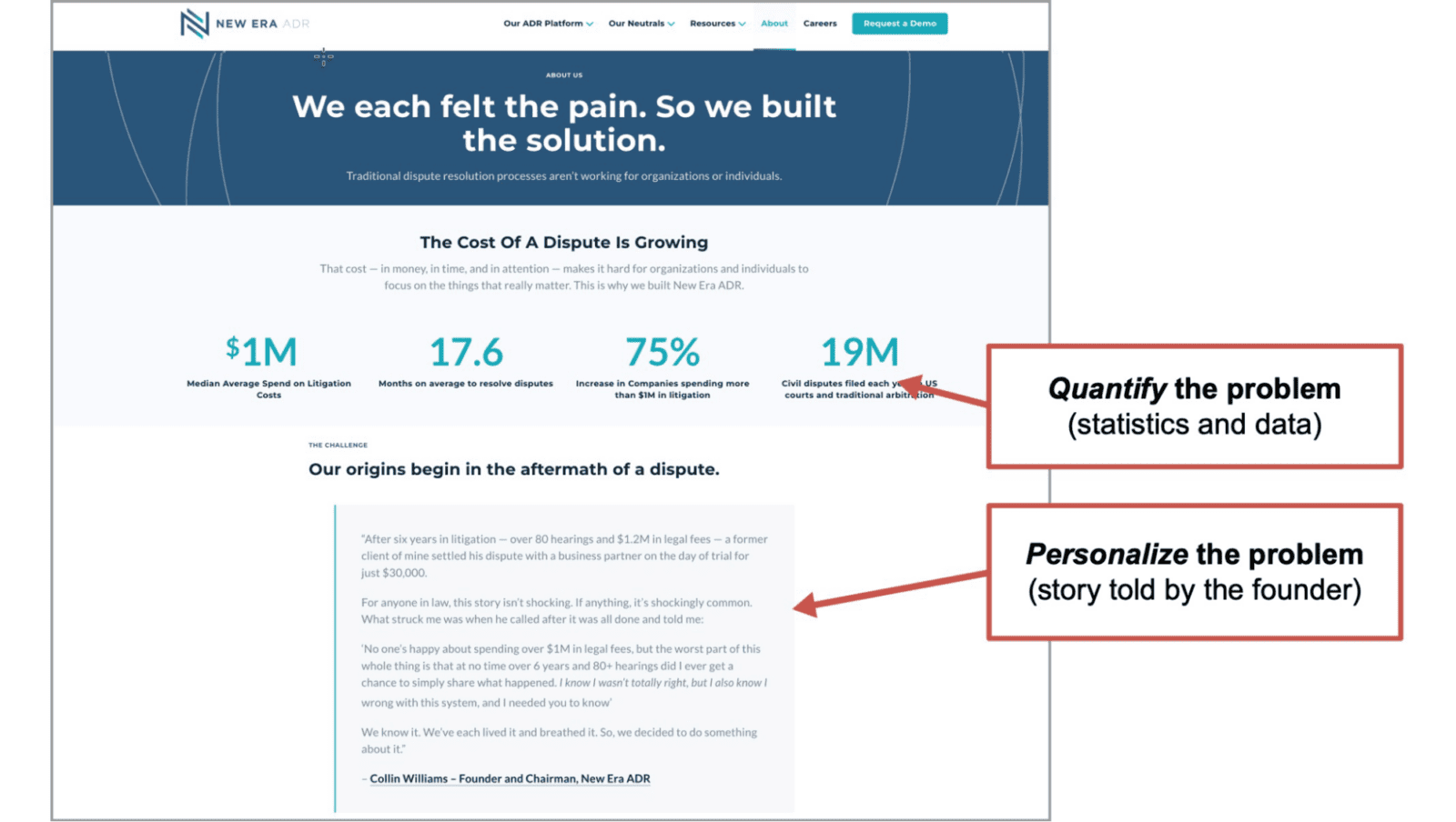
Example About page: New Era ADR is an alternative dispute resolution platform. The About page starts with the size of the problem, quantified in dollars, time and number of disputes. That’s followed by a letter from the founder, telling a true and personal story that connects on a more emotional level.
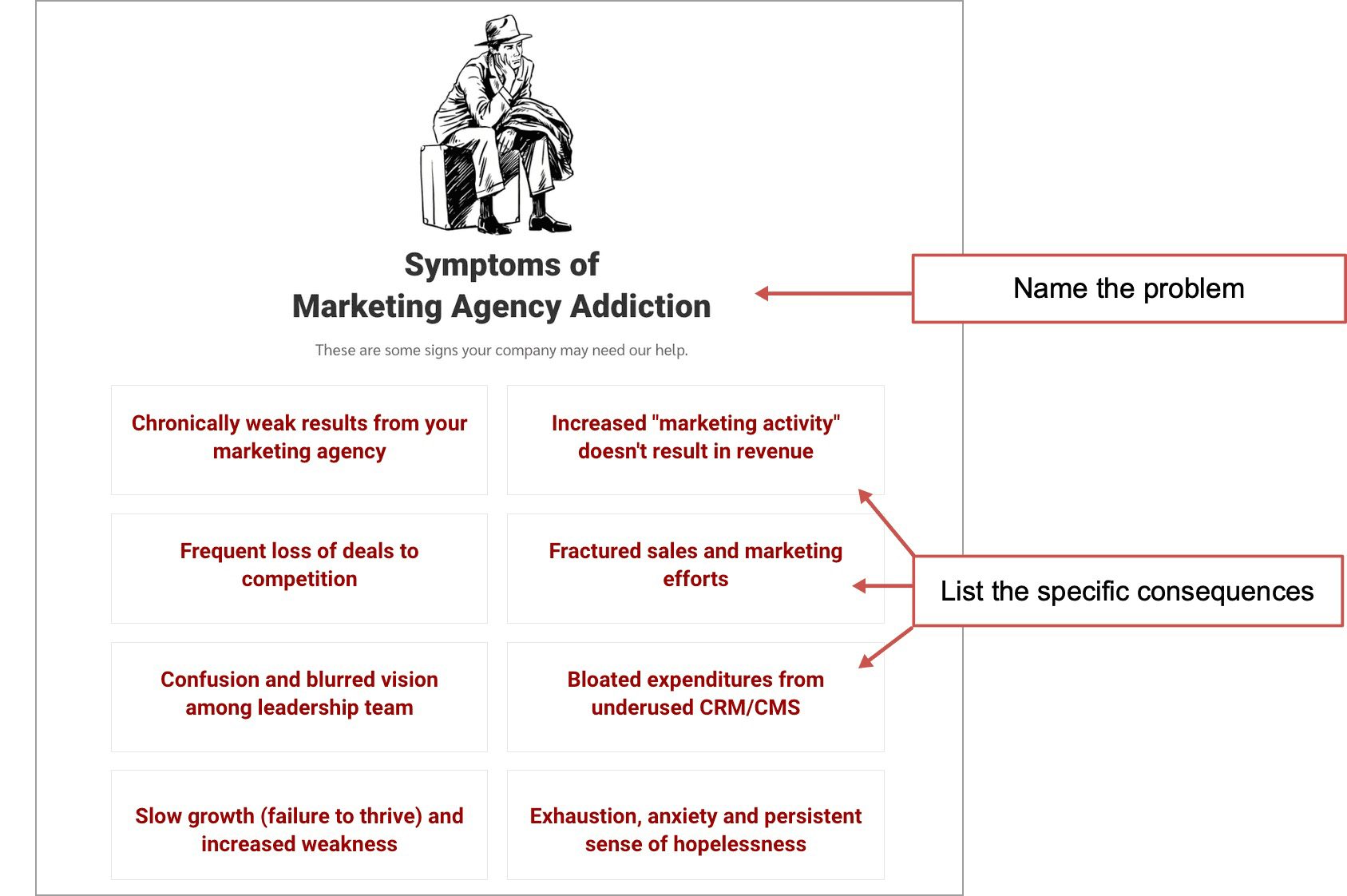
Example About page: Sales Artillery actually names the conflict “Marketing Agency Addiction” and lists the specific problems. It’s an excellent example of how a page can identify with the visitors’ needs.
3. What do these people believe?
Story elements: Plot
The beliefs of the people behind the brand are revealed in the story, or can be simply stated in a mission, core values statement or even a brand manifesto. A manifesto is a values-aligned commitment that states “we declare that as a company, we will always do X.” It’s a direct and powerful statement.
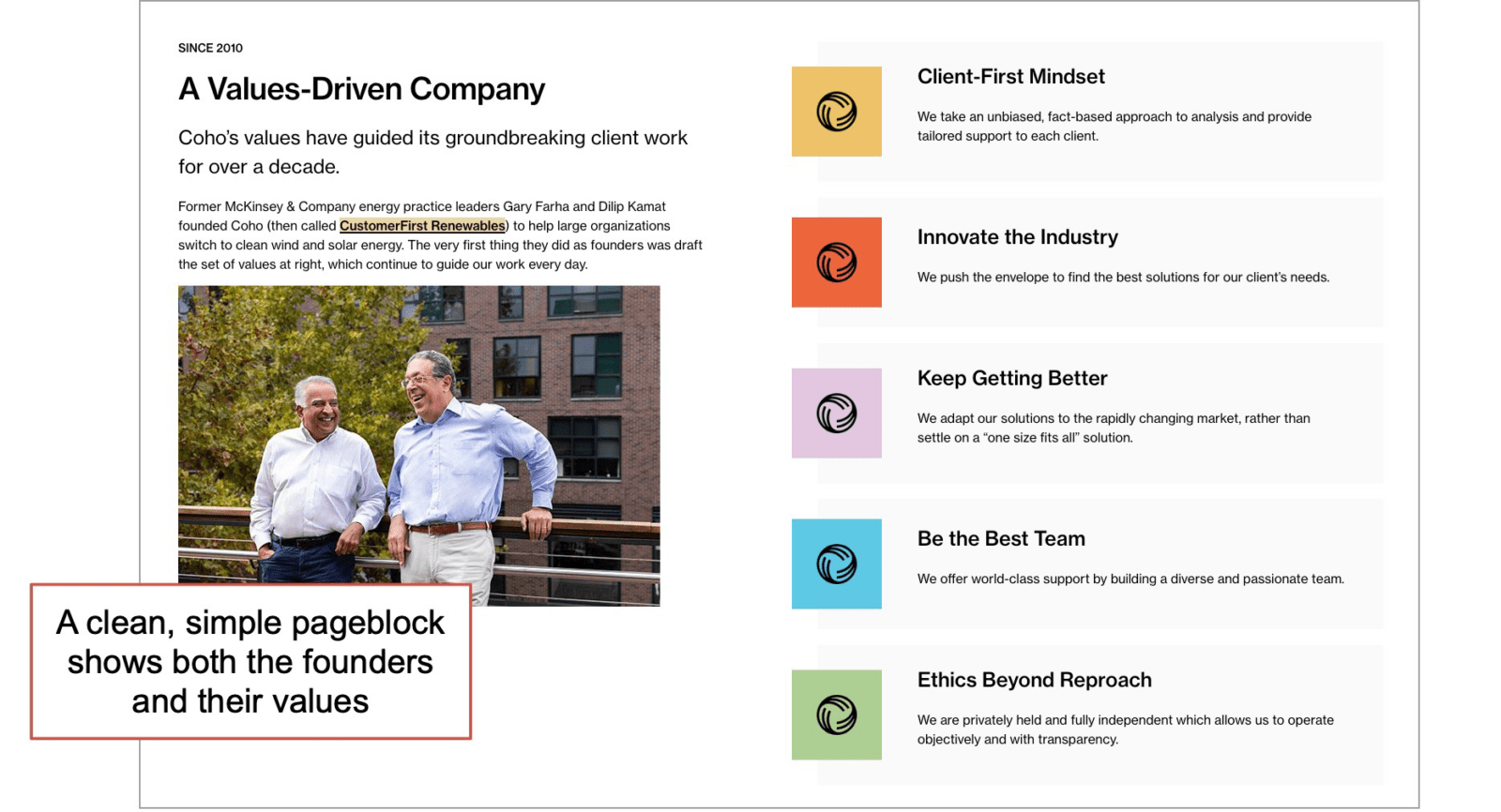
Example About page values: COHO offers climate and sustainability advisory services. The about page shows their team, their founders, their mission and their values. Visitors instantly see the who and the why.
Another way to show what you stand for is to not only share your values, but tell how you are living them out.
 |
Emmily Soccorsy, Root + River“Brands that share beliefs are good, but brands that tell what action they are taking to make that belief real are engaging the audience and answering the key question: are these people I want to work with?” |
There are other ways to show your virtues. Some certifications align with virtues (B Corp certification, for example) as do some awards and memberships. These have the advantage of being visual. When added to an about page, they work as differentiators and trust builders.
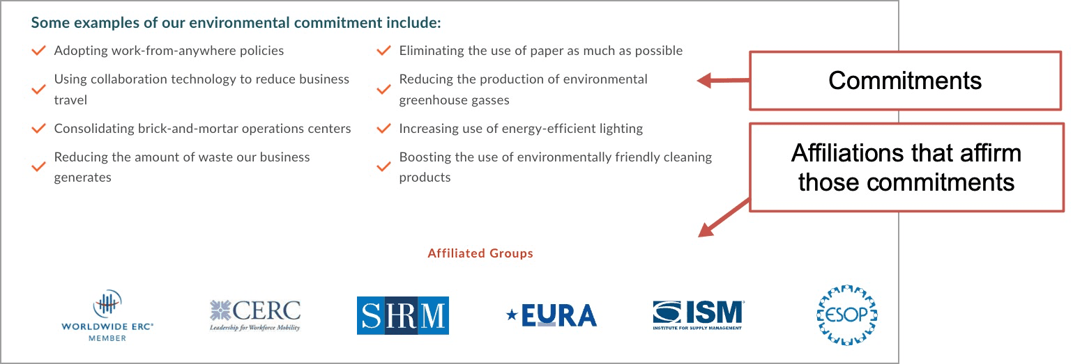
Example About page: TRC Global Mobility offers domestic and international relocation services. Their about page lists their values and commitments, but also shows involvement in groups that also support these commitments. Each group logo works as a trust seal, and those visuals are always near the top of the visual hierarchy.
Your story begins with this conflict. In classic case study (or customer story) structure, this is the problem, which is followed by the solution and the result. Another structure that works well for About pages is the timeline or history page, which usually begins at this moment of conflict.
Example About page history block: Greater Chicago Food Depository
They are champions in the community, but few know their origins. This simple page block sets up the why, and guides the visitor to the full timeline if they’re interested in learning more.

4. What problem do they solve and how?
Story elements: Resolution
The conflict is resolved for both types of characters, the brand and the client, by the brand and its services. The brand exists to solve the problem, and its actions are the solution.
In other words, the conflict and values flow into the value proposition and the results. So here you have the opportunity to re-introduce the product or service at a high level. Ideally, it includes
- Show how your resolution is different. Your approach is unique, ideally because it comes from your values.
- Add supportive evidence for your ability to resolve the conflict. This could be social proof or data.
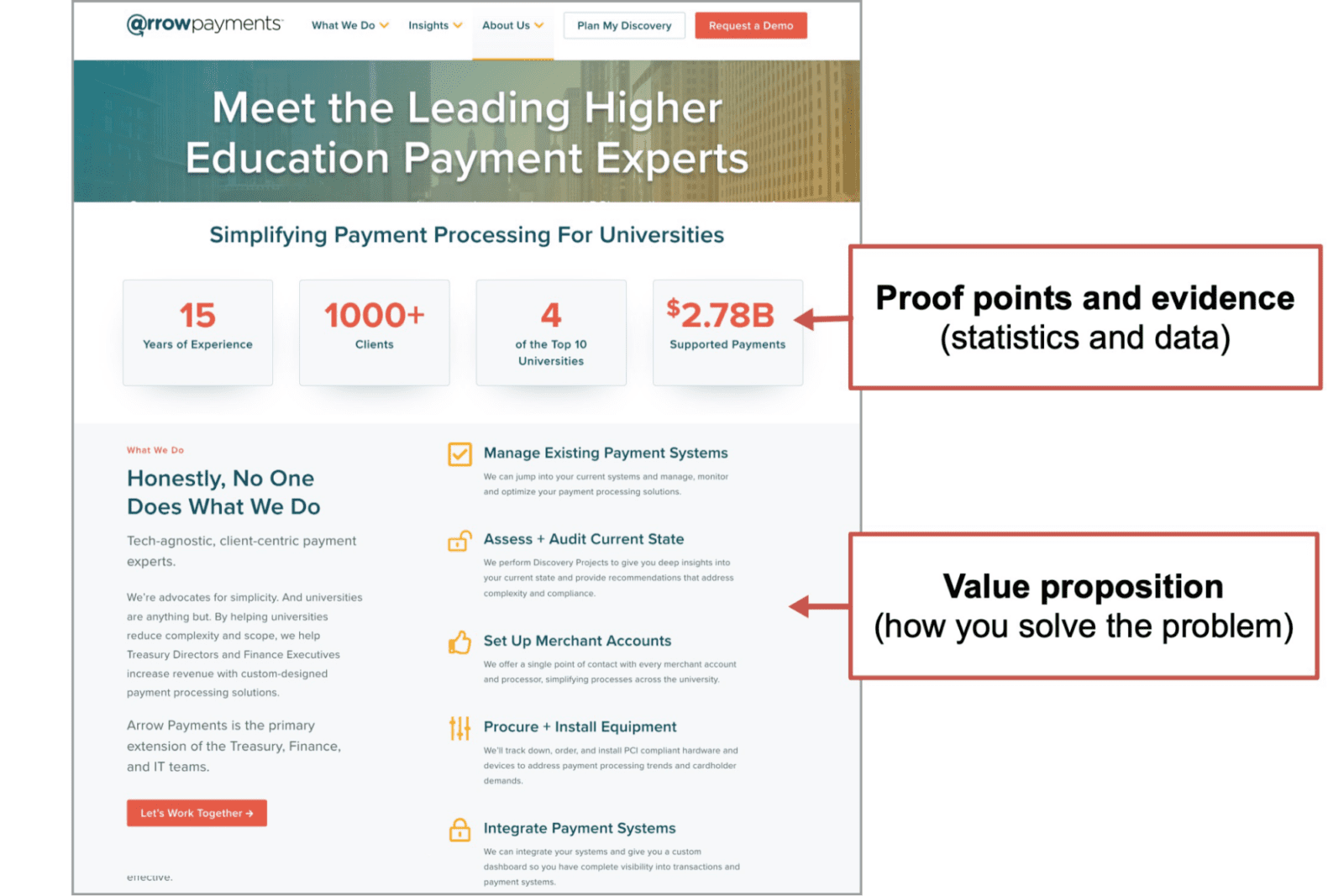
Example About page evidence: Arrow Payments does payment processing consulting for universities. Their About page leads with evidence and is followed by the services, presented with their difference from other approaches.
If this makes your About page feel like just another service page, that’s ok. Remember, it’s a step on the path to conversion. It tells a story, but it also sells. The ideal outcome is a click on the call to action.
5. What do they sound like?
Story elements: Dialog
Quotation marks are the most powerful key on your keyboard.
As soon as something is surrounded by quotes, it changes from copywriting to a point of view. It becomes more human. It also uses one of the most powerful story elements: dialog.
You transform a statement of service into a statement of values, just by adding a face and quotation marks. The “what we do” transforms into “why we do it.” It’s not a testimonial, but it is a testament.
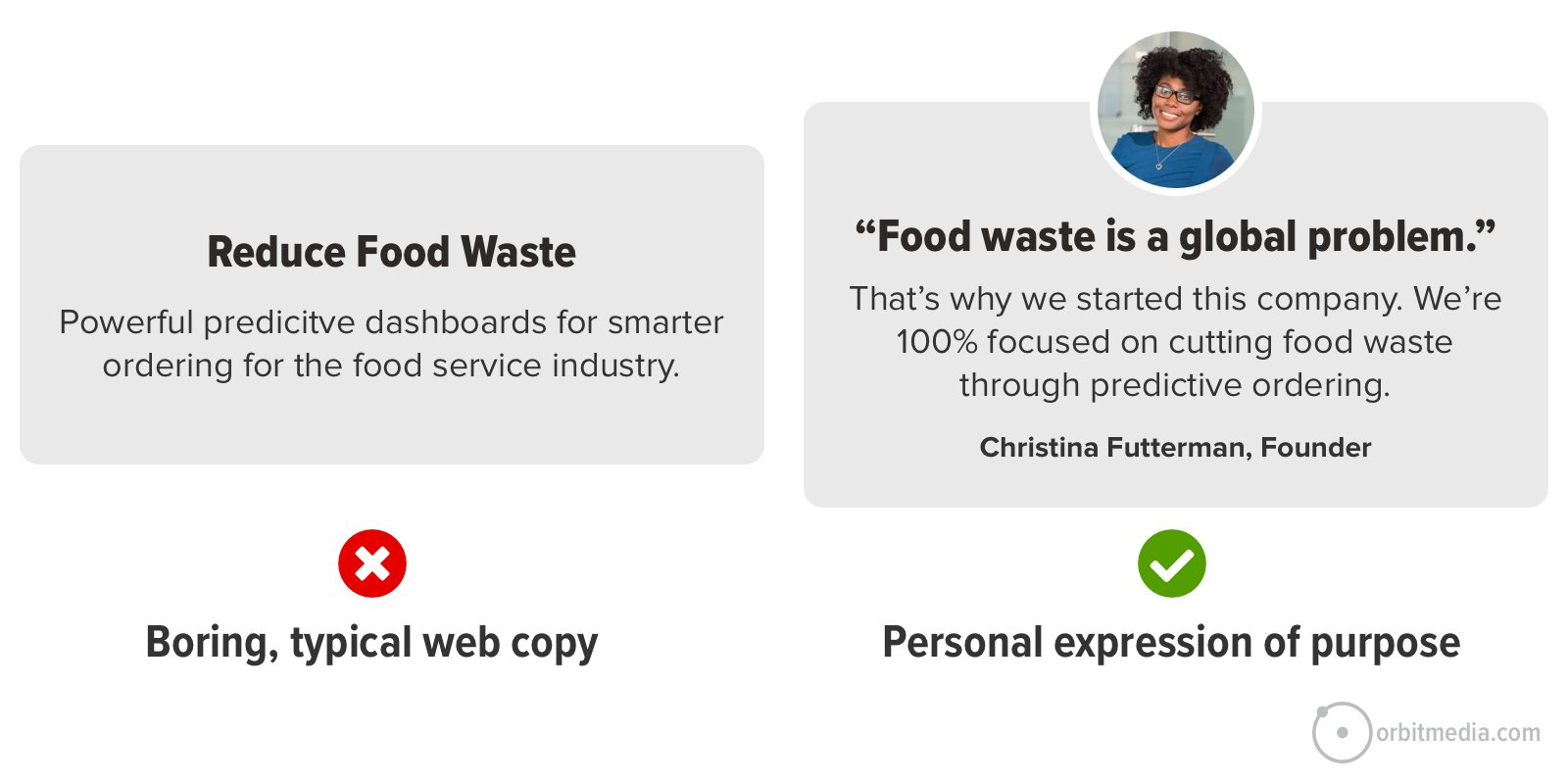
This is one of the three ways to let the visitor hear and feel the source of the brand.
- Quotes from leadership and team members
Easy to add and help the visitor feel a connection. - Videos that feature the leadership and team members
The About Us video that works like a mini-documentary, highlighting the story and values. - Social feeds, embedded into the about page
The visuals of recent social media activity can showcase the team, the culture and the values. - Blog posts, embedded into the about page
Especially when the content program includes thought leadership and strong perspectives.
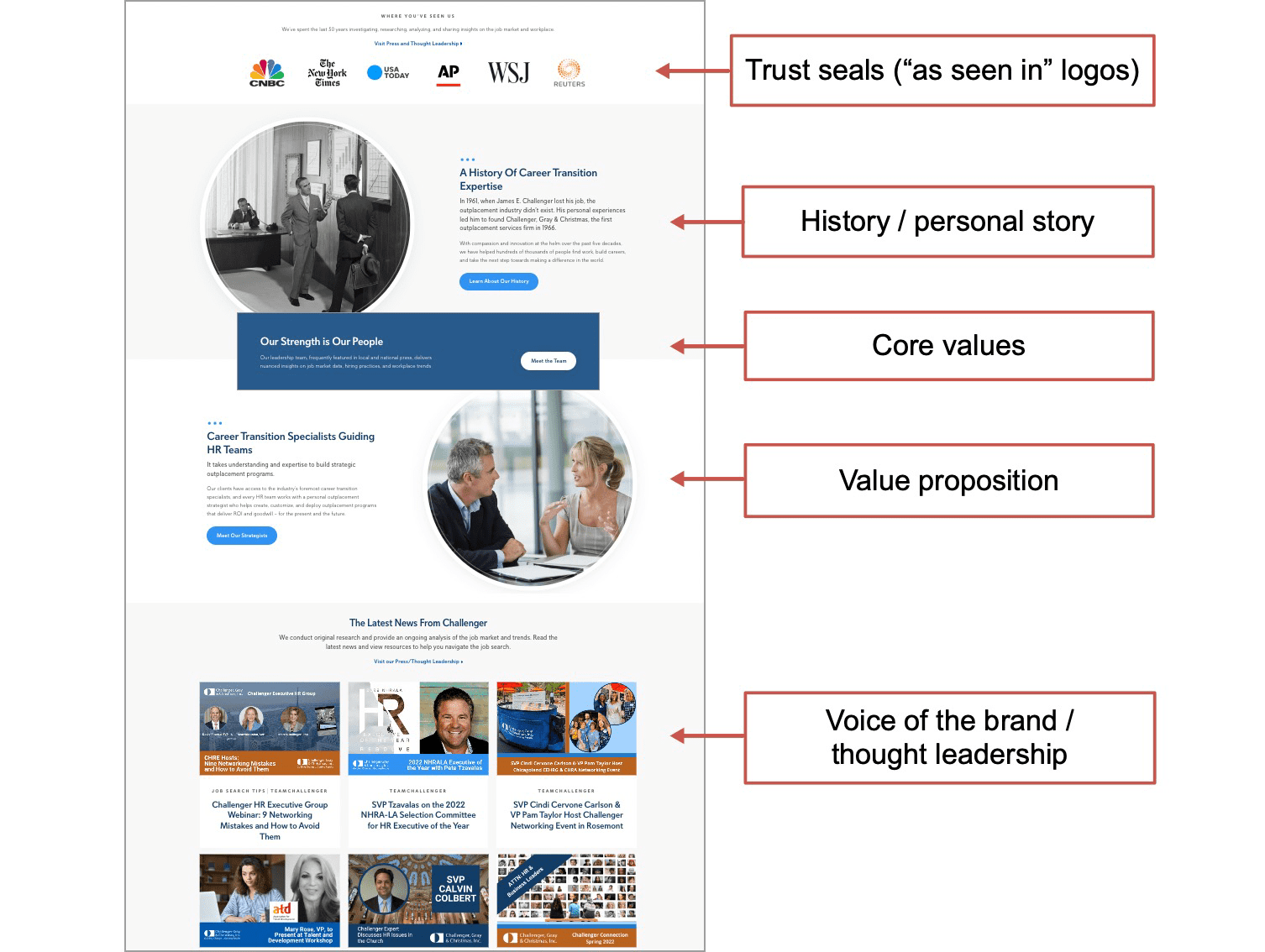
Example About page thought leadership: Challenger, Gray & Christmas is an outplacement services firm. Their about page features quotes, trust seals, history and values. But it also has the blog feed at the bottom. This invites visitors to jump into the content, where the voice of the brand comes through. And of course, it’s a responsive design so it works well for mobile users.
6. What is their vision?
Story elements: Sequel Preview
This isn’t part of every About page template. An About page generator will miss this. And a lot of brands just skip this part. But the About page is the perfect place to state a vision for the future, not just for the brand, but for the industry.
- Where are we going next?
- How does this align with our values and our clients’ needs?
- What do we think will happen that others feel is unlikely?
- What is the top concern for our industry in the long term?
- What will we be doing in 25 years?
This is another opportunity to plant a flag and differentiate the brand by sharing a strong perspective.
7. Where is this business?
Story elements: Setting
Finally, every story has a setting. And even global businesses have teams that are local to somewhere. When the About us page shows the location, the visitors don’t have to go to the Contact page just to find out where you are.
Location often comes up when introducing the characters and conflict, but some visitors won’t be ready to read. So here are two ways to answer the “where are you?” question visually.
- Pictures of the office interiors or building exterior
- Maps of locations
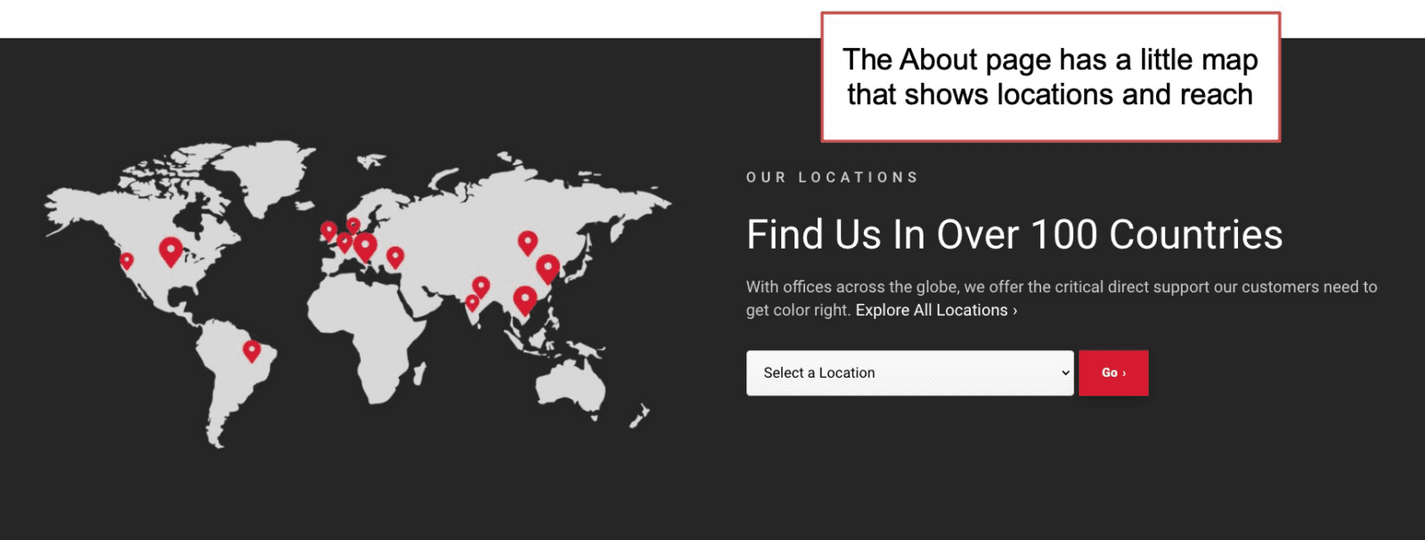
Example About page map: Datacolor does color management solutions for companies around the globe. Their international reach is something they show (rather than tell) on their About page. The little map is a simple visual element that shows which countries they’re in and the drop down guides the visitors to the closest location.
Fail the “French Test”
Some websites spend too much time with the “we love us” copywriting. They go on and on about how great they are. Rather than addressing the point of view of the visitor, every sentence is “we” “our” and “us.” If all or your pronouns are we, we, we (as in oui, oui, oui) then you failed the French Test.
But the About page is the one page that is supposed to fail the French Test. Your visitor is here because they want to hear you talk about yourself. They’re looking for your team, your story and your values.
So give them what they came for and share your story. Make it personal. Show why your brand is in the business. Support it with evidence.
Once you’ve improved it, you’ve improved a key step on your user’s experience. Next, go check the CTR on those CTAs. If you told your story well, don’t be surprised if you see a lift in leads.
Thanks again, Todd Jones, the About Page Guy. In our conversation, Todd shared all kinds of storytelling and About page best practices with me, which made this a better piece. Much appreciated, Todd!
[ad_2]
Source link


