[ad_1]
Even though healthcare marketing isn’t brain surgery, it can be confusing to pin down which website elements matter and, moreover, which ones encourage conversions. That’s why we rounded up 13 examples of exceptional, effective healthcare website design that you can learn from—and copy—to improve your own site and boost those conversions.
In this article, you’ll find:
- Why you need to worry about healthcare website design
- Healthcare website design examples
- How to improve your healthcare website design
Let’s get right to it.
Why you need to check up on your healthcare website design
About 7% of all Google searches are health-related. This number is staggering when you consider that there are approximately 8.5 billion Google searches each day.
Of course, not all searches will lead to a doctor’s office visit. Many of these are likely simple questions about how to properly use OTC medication or what to do in hypothetical scenarios. But these numbers make it clear: Your patients and your prospective patients will find you and engage with you online.
That’s why it’s essential that your website encourages the same confidence in your medical expertise, in your quality of care, that a visit to your office does.
The 13 best healthcare website design examples
The best way to get ideas is to look at other website examples. So to help you out, we’ve rounded up the best healthcare-specific website design examples to inspire your own!
1. Maven – Use color psychology
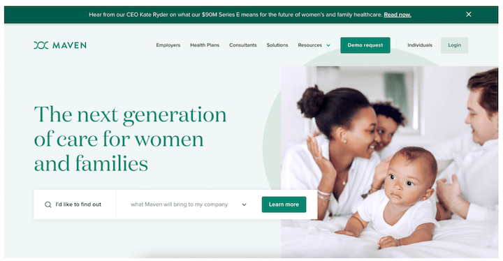
Even though this might seem low-stakes, the colors that you choose for your website are important. Color psychology is a thing. Take Maven’s all-green website, for instance.
Research suggests that the color green can have a psychological impact, improving pain and anxiety. Maven’s monochromatic color palette seems intentional—and like an excellent choice.
There’s good reason to put some thought into your website color scheme.
2. One Medical – Appeal to your audience’s values
In healthcare, knowing your patient is key. In healthcare marketing, it’s knowing your audience.
Take the One Medical homepage. The tagline promises a new experience, the young human faces in the photos suggest a pleasant experience and a sleek office, the copy emphasizes the all-hours access to medical advice, and the log in option in the nav bar underscores this. Plus, peep the soft green. The appeal to busy, connected Millennials is clear and consistent.
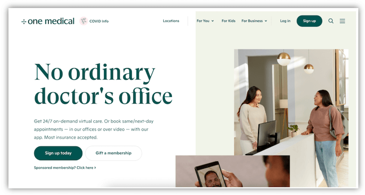
And One Medical knows that there’s opportunity in doubling down: 43% of Millennials are likely to switch practices in the next few years.
If you know your audience well enough to identify what they value, understand what their pain points are, and articulate how your offering is ideal for them, you’ll be able to ensure your website design appeals to them directly. And keeps them returning to your site for more information and your practice for more appointments.
3. Mayo Clinic – Answer the why
There are so many searches for health-related questions because there are so many concerns. Whether it’s a gut check about mixing meds when you have a cold or a search for more information about recent symptoms. But as a healthcare provider, your prospective patients have one pressing question: why choose you?
So in addition to frequently asked questions and informational pages about your practice’s specialty, make it loud and clear right off the bat why you’re the right choice for your patients.
Mayo Clinic does this really well right beneath its hero image.
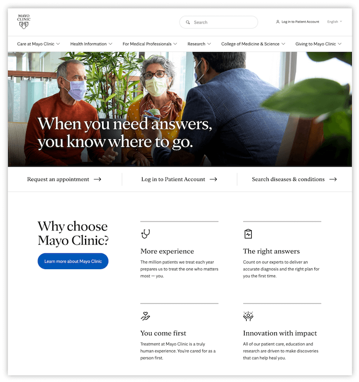
This highlights more information on the clinic—its research, its approach, its expertise, and its impact.
4. Synergy Private Health – Use faces
People like seeing other people, and research supports this. When users are viewing a page with human faces, their eyes are naturally drawn to the people in the images.
If you do it right, using photos humanizes the experience and encourages trust. The most important thing is to avoid stiff stock photos and instead feature personal images. If you can include the health care providers, that’s even better.
Take a look. Synergy Private Health’s hero section contains a rotating gallery of images. The sleek office space, patients at home cooking, a calming exam room, and the practice’s two doctors.
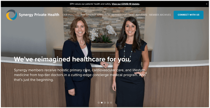
These two doctors look welcoming and professional, especially at the front desk of the practice. Plus, the copy’s first-person plural emphasizes the effect, as though the doctors are speaking directly to the prospective patients. That’s conversational copywriting done right! Well done.
5. Brightside Health – Stay consistent with your CTAs
When you’re working on your healthcare website design, you need to prioritize functionality, too. 67% of patients prefer online booking. This isn’t a surprise—when it’s a routine appointment or something awkward to get into over the phone, online booking makes the process painless.
So you need to make sure you can offer that simple, painless experience to your patients or prospective patients.
Brightside Health makes this easy with design. The call to action is “Start With A Free Assessment,” and this appears in the website header as well as the hero section with a contrasting, but not overwhelming peachy color.
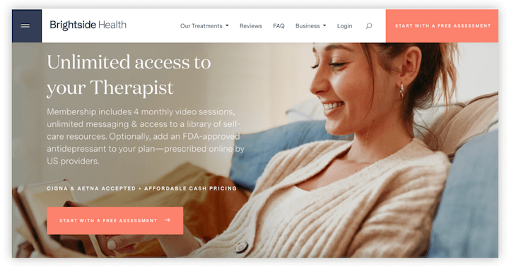
Keep the design for your online booking CTA—including color, placement, and process—consistent.
6. Simple Practice – Include reviews & stars
If you’re a marketer, you probably know how valuable positive online reviews are for any business, and how detrimental bad reviews can be.
That’s because so many of us turn to online reviews of a product or service before committing. The same is true for healthcare. In fact, 94% of healthcare patients use online reviews to evaluate providers.
Now, Simple Practice is a little different. This isn’t a healthcare provider, but a service provider for healthcare. Still, the website design is awesome, and it’s the best way to make the reviews visually appealing and easily accessible that I’ve seen.
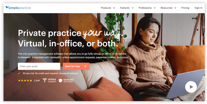
The stars and the number for the 2,000+ great reviews are subtle underneath the form, and they are provided in line HIPPA and HITRUST compliance badges. Even better, they’re clickable, and take you to a page with dozens of personalized text and video reviews.
7. Northwestern Medicine – Include your pandemic guidelines
Even though we thankfully have vaccines and a much better understanding of how to prevent and treat the illness, we’re still living with the Covid-19 pandemic. Your office still has pandemic-specific guidelines, and many of your patients want to know about them.
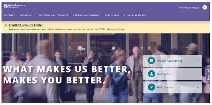
Including a tab or a prominent banner, like in the example from Northwestern Medicine below, gives your patients and potential patients easy access to this information. And providing your approach and policies gives peace of mind that it’s a priority.
8. Virtua Health – Cater to prospective and current patients
When you’re thinking of website design, it’s natural to consider the needs of prospective patients first. But don’t forget that your existing and returning patients will use the website frequently, too. It should be clear that it serves them, as well.
Virtua Health provides its patients with a few quick ways to access all the information they need with the MyChart and Telehealth links in the top nav, as well as the drop-down “Patient Tools” option.
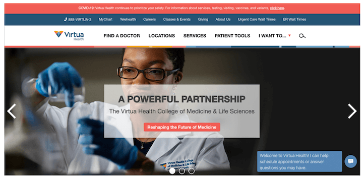
Plus, the intro copy for the chatbot is purposely vague. The offer to schedule appointments or answer questions works for both existing and new patients.
9. Dr. Rachel Paul – Celebrate your celebrity
Reviews, photos of people, and explanations of your expertise and approach are all great for encouraging your website visitors to be assured that the care your practice provides is top-notch. But it’s not the only trust signal you have at your disposal for healthcare website design.
Take Dr. Rachel Paul’s website. The nutritionist has a sizable following on social media, so linking these Instagram and Tik Tok accounts prominently in the nav presents a cohesive brand identity.
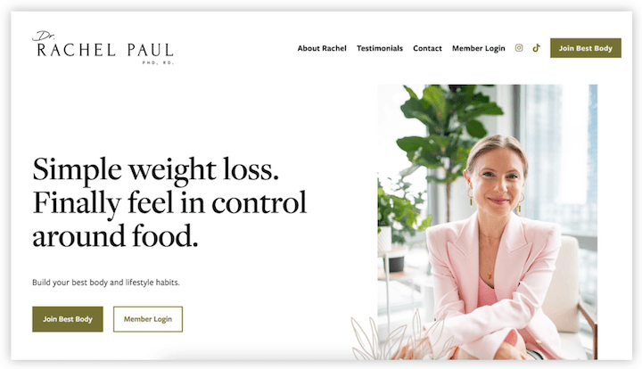
Farther down the page, the website features logos from all of the press the nutritionist has received.

These logos are recognizable, which means they’re a great way to build trust. If you have the opportunity to point to similar press or achievements, use this on your website.
10. Mass General Bringham – Let the numbers speak
Another great trust signal that takes longer, but is much simpler: Numbers.
Mass General Bringham celebrates its extensive network of providers, significant funding, innovative research, and vast number of annual patients on its homepage to show patients just how experienced the organization is.
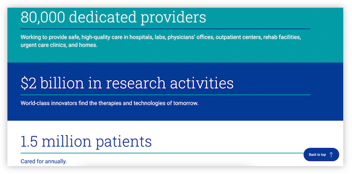
Even if your practice is much smaller, you might have some impressive numbers to use on your website.
11. Hartford Healthcare – Animate your homepage with a video
Featuring real people in your photographs is an excellent way to humanize your brand. If it’s possible, video can be similarly effective for capturing the experience at your practice, allowing your healthcare providers to speak directly to your potential patients, or showcasing the results of working with your practice.
It’s this last method that Hartford Healthcare uses in the video on its homepage.
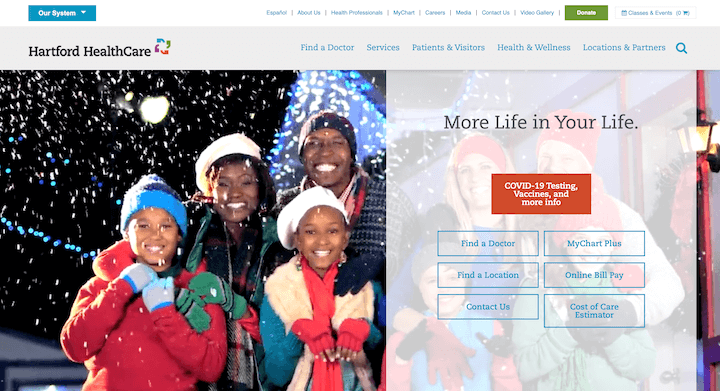
The video showcases four healthy adults riding bikes on a picture-perfect trail in the woods. The people are talking casually while exercising outside in the crisp fall air—the image of health.
12. The Lasik Vision Institute – Make it easy to find you
Not every visit to your website will lead to a new patient. But you need to make it as easy as possible for any visitor to become a patient.
The best way to do this is to ensure that it is easy and practical to find and contact your office, or office(s).
The Lasik Vision Institute is a great example for this, since it’s a national chain of providers. The website features a location search on the homepage, and the main telephone number is locked in the navigation bar for the website.
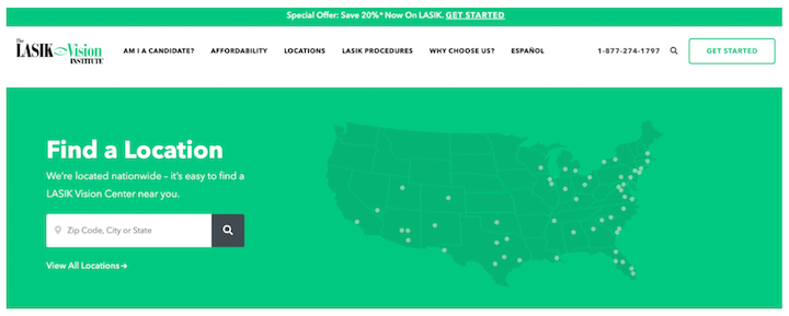
No frustrated searching or returning to Google for a phone number or location search here. Make sure your website offers the same.
13. Tia – Express your unique brand
All doctors offices are not the same, of course. But even all OBGYNs or chiropractors or psychologists are not the same. Your practice offers something specific, and you need to make sure you incorporate your unique branding into your website design.
Take a look at how Tia, a provider that zeroes in on serving female and AFAB patients and takes a holistic approach to patient care, does this. The website’s color scheme is peachy and the graphics are simple and doodle-like.
Here’s how the website represents this approach.
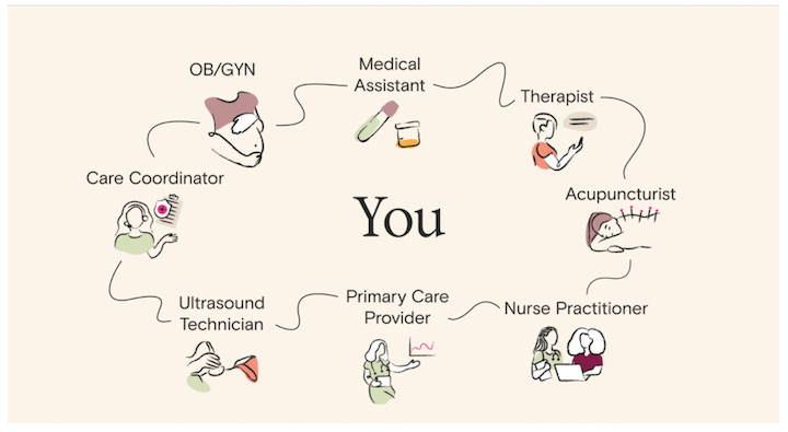
Tia follows this up with a text explanation of the process, which is great (and also crucial for website accessibility). But remember, visuals are often more engaging and easier to skim. Make sure you have your differentiator easy to see.
Improve your healthcare website design with these tips
These healthcare websites offer a ton of design examples that you can use to enhance your own site. We went over a lot of tips to imitate each effectively, so let’s review those here:
- Use color psychology in your website color scheme.
- Add messaging that speaks to your target audience.
- Tell prospective patients why they should choose you.
- Humanize your brand with real people, in photos or videos.
- Surface your reviews and ratings.
- Include your pandemic guidelines
- Cater to both prospective and existing patients.
- Celebrate your celebrity
- Use numbers to show your credibility
- Make finding and contacting your office easy.
- Showcase your unique brand identity.
- Animate your homepage with a video
- Prioritize accessibility.
Now, use these tips and these designs for inspiration to improve your own website and grow your practice!
Looking for more website designs and examples? We’ve got em for ya:
[ad_2]
Source link


