[ad_1]
Humans are simple, monkey-like creatures.
We have two eyes on the front of our heads that face forward. From an evolutionary point of view, this makes us great hunters but it also means that vision is one of our most dominant senses.
Art and visual design’s role in our lives is a testament to that. Not to mention that, in most cases, when we’re attracted to something, it’s because we like how it looks.
Modern businesses and marketing know how much emphasis we put on visual identity.
In other words, a business needs to ‘look nice’, or at the very least, look familiar and appealing, to be liked.
In this article, we’ll take a deep dive into visual identity, show you what it is and explore a few examples from brands you know and don’t know.
Table Of Contents
What is visual identity?
A visual identity is a unique combination of colors, shapes, fonts, and other design elements representing a company or brand.
It’s what makes a company or brand recognizable. It is one of the most important aspects of any marketing or advertising campaign.
Bringing all these elements together harmoniously creates a brand identity and lays the foundations for brand recognition and telling a brand story.
These elements, based on visual identity, can help a company or brand stand out from the competition, build customer loyalty, and effectively communicate its values and message.
The importance of a visual identity
A company’s visual identity is fundamental, and it is what customers see when they think of that company. A well-designed visual identity can effectively convey a company’s message to its customers, so getting it right is critical.
Distinct
Branding helps you stand out from the crowd, so stand out from the crowd. Be unique, recognizable, and memorable in the way you create your brand’s visual identity.
Example:
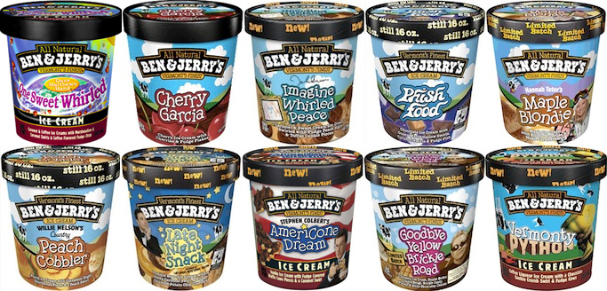
Ben & Jerry’s Ice Cream looks different depending on the flavor, but the logo is never obstructed, and the black lid, blue sky, and green grass are always visible, making it easily identifiable on retail store shelves.
Timeless
The world in which we live today is different from what it was 12 months ago, which is significantly different from what it was 12 years ago. Good brands stand the test of time.
Economic booms and busts, global pandemics, wars, and other cultural changes will change what’s important to your customer. Your brand’s identity should be visually resilient and endure through its evolution rather than constant revolution.
Example:

This Wrigley’s advertisement from the 1920s communicates the same values and uses the same motives as today.

Simple
Your visual design can be elegant, intricate, and complex, but the messages, values, and morals that identity stands for must be concise and to the point.
For the viewer, it’s easy to understand and quickly delivers the message without analyzing what’s being shown. Simplifying messaging in your visual identity is vital to building awareness and recognition.
Example:
Mr Fothergill’s is a UK producer and distributor of seeds, seedlings, and other outdoor and garden products.
Quickly you can see what the brand stands for – a traditional, healthy, and happy garden.
Functional
Your visual identity has to be applied over many mediums: email templates, websites, letterheads, branded packaging tape, business cards, and even the product itself.
Whatever your visual identity is, it needs to be functional, versatile, and flexible enough to be applied to every part of the world where your business will be seen.
Example:

Brahmaki is a Swedish manufacturer of kaftans and loungewear. Their warm branding defines their homepage and is perfectly echoed in their packaging design.

Suitable
Whatever your brand stands for, does your visual identity evoke the emotions of those values? The visual appeal of your brand must suit the message.
Example:

Revolut does ‘all things money’. Banks do ‘all things money’ too, but they’re cold, sterile, and often overly formal. Revolut’s visual identity challenges this with color, simplification, and a little personality.
Memorable
A brand’s visual identity should also be memorable. In a crowded marketplace, especially one for commoditized products or services, instantly recognizable and memorable elements are vital to a brand standing out from the crowd.
Example:

K&C is a Munich-based IT outsourcing and custom software development company that created a set of illustrated cartoon characters as part of a recent re-branding from an old-fashioned, conservative B2B style that had little to distinguish it from the crowd. They now feature across the company’s website and in all off-site content marketing and are instantly recognizable, triggering the familiarity that helps a brand build trust with its audience.

Identity: brand vs visual
If your brand were human, it would have clothes on the outside and a personality or soul inside.
With this euphemism in mind, your brand identity is the personality or soul, and the visual identity is how your brand dresses.
Brand identity
Brand identity is considered the ‘soul’ of the brand – it’s what makes the brand tick. When your brand’s product or service is stripped away, your brand identity is what’s left.

Simply put, your brand identity is your ‘why’ – your mission, goals, values, principles, morals, voice, and personality.
Visual identity
Visual identity is how you visually communicate your brand’s identity. Whatever it may be, your brand’s visual identity is expressed through color palettes, typography, patterns, fonts in your logos, and so on.
The elements of a visual identity
Your visual identity is the overall look of your business, including your logo, color scheme, and typography. It’s how your customers will identify you, so it’s essential to put some thought into creating a cohesive and attractive design.
Some elements to consider when creating your visual identity include:
Your logo
This is often the first thing people will see, so make sure it’s simple, memorable, and reflective of your brand.
Your color scheme
Choose a few colors that work well together and that you’ll use consistently across all of your materials.
Your photography
Stylized photos, brand shots, product photography, and lifestyle photography are essential in conveying your visual identity.

Arguably, User Generated Content (UGC) is also part of your brand identity – not so much the content that your customers create, but the customers themselves are products of your visual identity.
Your typography
Choose one or two fonts that you’ll use for all of your communications. Make sure they’re easy to read and work well with your color scheme.
Creating a visual identity
There are a number of factors to consider when creating a visual identity for a company. The logo should be simple, easy to remember, and consistent across all communications materials.
Brand identity – again
Lean heavily on your brand identity when starting to create your visual identity. Your brand identity is your purpose, values, goals, and morals. It should set a precedent for how your brand visually ‘feels’.
Biotika uses its candle packaging to communicate the minimalist, natural, handmade, and organic nature of products and their ingredients.

A fine example of alignment between what the brand is offering and what the customer is looking for.
Customers
The role that your target market and ideal customer can’t be understated here either. It wouldn’t be appropriate to visually brand a children’s toy brand to look like an industrial tool brand.
You may have an idea of who you want your target audience to be, but aligning what your customers want, how you’ll attract and interact with them can’t be understated in the beginning. Developing buyer personas is critical and can be done via surveys and market research.
Marketing agencies rely on determining target audiences by analyzing the competition. In fact, naming 3-5 competitors is one of the more common questions in most client onboarding questionnaires.
There’s no need to copy them, but these brands are established and living in the ecosystem you want to have a space in, so they must be doing something right!
Visual identity and product harmony
As just mentioned, there needs to be a synergy between your visual identity and your customers – it needs to meet their expectations. But your visual identity also needs to be true to your product.
For example, a subscription box company offering organic vegetables wouldn’t have a visual identity akin to Gucci.
Such an idea, organic vegetables, invokes thoughts of a farm, getting dirty, being in nature, health, and nutrition as nature intended. It’s these concepts and ideas that should impact the development of your visual identity.
Style guides & consistency
As your business starts to grow, you’ll probably have more than one person whose using and adapting your branding and visual identity to various mediums. Being consistent is essential, as any jarring experiences between, for example, your online store and your physical store won’t help build your image.
A style guide helps minimize the chances of such friction.

From correct image ratios, and colors in various palettes, to the values you communicate and the words you choose to do so, a style guide or brand book will ensure that consistency and help you communicate more effectively across all mediums.
Use a professional
Working with a professional designer with a trustworthy portfolio is vital to creating a compelling and memorable visual identity. A good designer will help you to develop a branding system that accurately represents your company and its values.
Maintaining a visual identity
You read earlier that timelessness is important to visual identity.
That’s not to say that once you’ve created your identity, you have to stick to it for eternity, but rather that maintenance is better than rebuilding.
As the world in which your business operates changes and your customer’s values ebb and flow, your visual identity will need to follow suit. When updating your brand’s identity, evolution is better than revolution.
Rebranding is a powerful tool, but it’s costly, can be risky, and isn’t always done with the right intentions in mind. Maintenance in the form of tweaking your logo, modernizing color palettes, and adapting other visual assets to new mediums is far more effective and easier to communicate.
Good brand maintenance is unrecognizable.
Examples of killer visual identity
You’ve read a lot about visual identity, now it’s time to see some examples and read why they’re good.
Caterpillar

Caterpillar, sometimes abbreviated as Cat, is a clean, bold brand that gets dirty. The brand produces work wear, but also industrial machinery.
The black and white of the color pallet complement the basic and bold typography, while the yellow brings in the construction/building/industrial edge and puts the brand where it wants to be.
M0ther
M0ther is a UK brand that sells gifts for new mums and mums that want a bit of time off from being a mum.

The brand is feminine and stylish and relies heavily on the use of pink. These elements are tricky, but M0ther manages to pull it off and appeal to their target audience in the process.
Stay Cold
Stay Cold are a German apparel brand that creates streetwear based on tattoo flash designs.
The brand is loud. It makes a statement, it isn’t afraid of being visually offensive, because it knows that its ideal customer wants to make a statement with the way they look and dress.
Patagonia
Patagonia is an outdoor clothing brand that’s revolutionizing the sustainable fashion industry. But that’s not what we’re talking about here.

The brand came about in the late 80s, and on closer inspection, you can see that the branding is somewhat dated to that period. The purples and oranges, the Romanesque font.
However, their branding also works in this day and age. The colors, while being bold, create the skyline of a mountain range, which is where the customers and users of the brand’s products spend most of their time.
Conclusion
Creating a solid visual identity is a complex process, but it’s worth the effort. If you can establish a consistent and recognizable brand, your business will be well on its way to success.
[ad_2]
Source link


