[ad_1]
High converting landing pages are characterized by their ability to get the reader to take a desired action. Unlike general website pages, visitors usually ‘land’ on a landing page (hence the name) after clicking a paid ad, social media post, link in an email, or some other external source.
Here are the 5 primary elements in place on all high-converting landing pages:
- Menu / Global navigation links are removed.
- There’s just ONE call to action.
- The headline grabs attention. It is neither boring nor shocking. (See tutorial!)
- The benefit of the offer is clear.
- Social proof supports clicking / filling out a form.
Ahem… Um… First: What even is a landing page?
A landing page is a stand alone web page with a single goal. That goal is usually (though not always) lead generation.
This is part of what separates sales pages, and other general website pages, from a landing page.
In addition, landing pages aren’t usually accessible using a website’s menu or navigation. They are accessed from paid ads, social media posts, email campaigns, or other links on the web.
What do high converting landing pages have in common?
The best landing pages do one thing well, and that’s convert traffic.
Whether you’re promoting an eBook, a contest, a free consultation or a quiz, the best indicator of whether or not your landing page works is if it converts visitors.
Conversion here means getting the visitor to take the desired action.
There are a few key elements that high converting landing pages usually have in common.
1. No menu/navigation links
Data shows that navigation links are a distraction on landing pages. So when it comes to landing pages, skip the navigation links to improve your conversions.
A landing page is a stand-alone page that has a single goal. Adding navigation may distract the audience by giving them multiple paths to take.
For best results, you should keep it simple by removing navigation. This makes it easier to guide the reader toward the desired action.
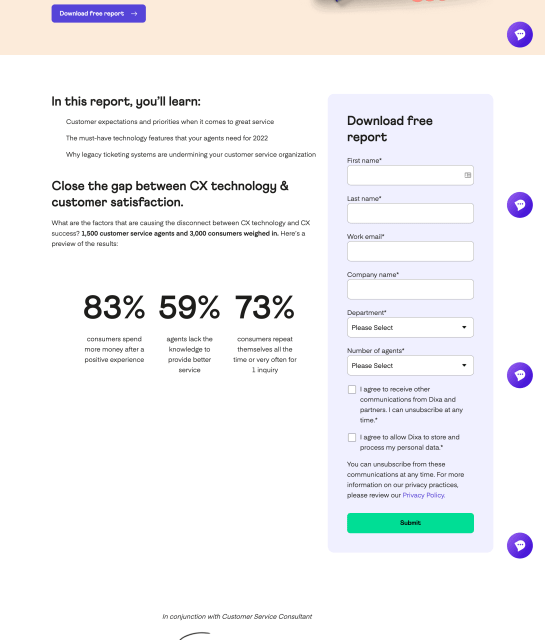
See it in action: Dixa
The Dixa landing page gets it right with navigation. There’s no menu to distract the reader, and the first CTA button appears prominently above the fold.
One thing they could’ve done better on this page though, is reduce the number of required fields on the opt-in form to reduce resistance.
2. A single call to action
Just like the absence of navigation, a single call to action helps keep your reader focused. It also increases the likelihood of them taking the desired action.
According to Hick’s Law, when we’re given too many choices, we take longer (and are less likely) to make a decision.
In marketing, we refer to the phenomenon as choice paralysis, and yes — it affects landing page conversions too.
See it in action: ExpressVPN
This ExpressVPN landing page has a single goal — get the reader to start a free 30-day trial.
There are multiple CTA buttons on the page, but every single one prompts the reader to do the same thing — start a trial.
There are no other links or buttons to distract the reader, because all roads buttons lead to the free trial activation.

3. A captivating headline
Your headline is one of the first things your page visitor will see, so it’s important to ensure that it captures the essence of your offer.
High converting landing pages have headlines with a value proposition that clearly states the benefit of the offer to the reader.
In the Tutorial Tuesdays video below, Joanna Wiebe of Copyhackers shares some useful formulas you can use to craft your headline.
4. Clearly defined benefits
Your landing page should answer the question — what’s in it for me?
It’s important to give your visitor a valid reason to keep reading your landing page. And the best way to do that is by explaining the value of your offer in plain simple language.
If you watched the Tutorial Tuesdays video above and completed the exercise, you would’ve likely come up with multiple value proposition statements.
These statements can be sprinkled throughout your landing page. Copy that didn’t make it into your headline can be used at other points on the page.
See it in action: Meat & Hair Daily
The landing page for Ash Ambirge’s Meat & Hair Daily newsletter does a good job of highlighting the key benefits for the reader.
The main headline, “Write more creatively in just 1 minute a day” captures the essence of the newsletter while making a bold promise.
Each section of the page has a different unique subheading that echoes this same promise to the reader.

5. Social proof
Trust signals like reviews and testimonials on your landing page can improve your conversion rates. That’s because we trust the opinions of others like us.
Reading someone else’s positive experience with a product or service makes us more trusting and more likely to try it.
When adding social proof to increase trust, aim to add names and photos if possible, as those elements can all boost the credibility of your reviews and testimonials. If your brand is B2B, consider adding job titles as well.
See it in action: Hello Fresh

Hello Fresh does a great job with social proof on their landing page by using actual customer photos and captions directly from social media for social proof.
More copywriting tips for high converting landing pages
1. Begin with the end goal in mind
That means starting with the question, “What do I want my reader to do?” Then use the answer to that question to shape the copy for your landing page.
“Start with the goal. The call to action. The thing you want visitors to a landing page to do.
Then, work backward from your button, writing ONLY copy that will convince people to click that button. Nothing else makes it on the page. Nothing.“
2. Be mindful of your reader’s stage of awareness
It’s always a good idea to write your landing page copy to address your reader’s key problem or concern.
That means writing for their stage of awareness, being mindful of what they know and don’t know.
This is important, because if the reader can’t relate to the copy or see themself on the page, they’re going to leave.
This post on writing landing page copy for problem aware visitors covers the topic in great detail.

Where to start? Resources to build your own high converting landing pages
When you’re ready to implement these tips and build your own high converting landing page, here are some useful tools to get started.
Canva
Canva is a free drag and drop graphic design resource that can be used to build landing pages. It’s a great all-in-one tool that includes images, graphics, lots of templates, and even hosting for your landing page if you need it.

Unbounce
Unbounce is a more robust landing page builder that was designed specifically for landing pages. Since it’s a specialized tool, it has better features if you’re looking for something more advanced than Canva.

Leadpages
Leadpages is another dedicated landing page builder that includes robust data collection features to help you test and optimize your landing pages.

Copyhackers + Leadpages landing page templates
These landing page templates from Copyhackers and Leadpages are a great starting point if you’re not sure how to approach writing copy for your landing page.

The post 5 key elements of high converting landing pages (with examples) appeared first on Copywriting for startups and marketers.
[ad_2]
Source link


