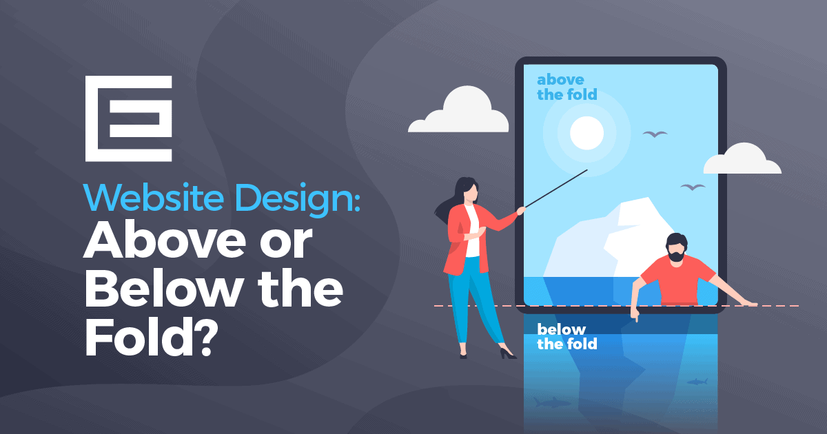
![Above the Fold vs. Below the Fold: Does it Matter in [2022]](https://wildfireconcepts-media.sfo3.digitaloceanspaces.com/2022/11/Website-Design-Above-or-Below-the-Fold.png)
[ad_1]
You may have heard or read the term “above the fold” and “below the fold” regarding website design. When you look at your website, it might not be obvious that there is a fold. Believe it or not, your website does have a fold, and being aware of it is important when it comes to where you place content. We will show you how to determine where your website’s fold is and how that can be useful when creating a knockout website.
What does above the fold mean?

The phrase “above the fold” comes from the newspaper industry. The fold is the separation between the upper and lower half of the newspaper. Newspapers are displayed to customers folded so that only the top half of the front page is visible. The most important or eye-catching stories and photos are often displayed above this fold to increase sales.
When it comes to websites, you can use the same concept, but it’s all about being “above the fold” or “above the scroll”.
Above the fold or above the scroll includes the contents of the webpage that can be seen without scrolling. Think about your typical screen. A default screen resolution will display approximately 600 pixels. After that, the user needs to scroll down to see the rest of the content. Everything within that initial 600 pixels is considered above the fold. The big question is, will your visitors scroll down past that initial content?
You’re taking a gamble to assume that your website visitors will want to continue scrolling to get to the good stuff. You will have to give the user enough content above the fold to make them want to continue reading. If not, they’re not only going to stop scrolling, but there’s a good chance they’ll find another site that gives them what they need above the fold to encourage them to continue scrolling and seeing the rest of the webpage.
With all of the advancements in responsive website design and computer sizes, different users’ fold on different machines is seldom the same. Regardless of the screen size, we design all of our sites to consider the fold.
Note: Below is common breakpoints for screen sizes. Knowing these can help you when testing your website and identifying what content appears above the fold.
Standard Website Resolutions For Mobile screens:
- 360×640
- 375×667
- 414×896
- 360×780
- 375×812
Standard Website Resolutions For Tablet Screens:
- 768×1024
- 1280×800
- 800×128
- 601×962
- 962×601
Standard Website Resolutions For Laptop Screens:
- 1920×1080
- 1366×768
- 1440×900
- 1536×864
- 1024×768
Using heat maps is a great way to help you determine where on average, the above the fold section is located for your webpage based on the specific site visitors your website attracts.
Using Heat Maps to Find Your Website Fold
Heatmap tools collect data from real-life visitors and display the results in various colours. In our example image, dark red showcases the most viewed section of the webpage, yellow for the less viewed sections, and light green for the least viewed sections.
Heatmaps can track where users are clicking or tapping on your website. They can show where visitors have moved their mouse on the screen. This data can be used with analytics to determine how often and how long users interact with each section on your webpage.
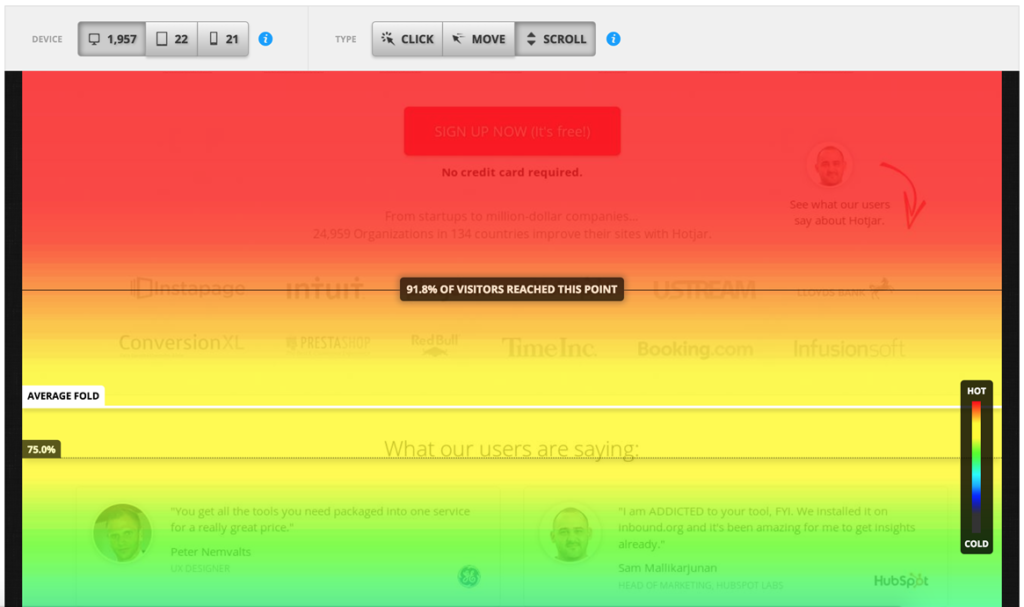
Scroll heat maps are the ones you’ll want to use to determine where the fold on your website is. They track how far each visitor to your site scrolls down while looking at your page.
Once you have your scroll heatmap set up and running for a few days, you can get an idea of where your visitors are spending their time on your webpage and where they begin scrolling. This data will inform you where the fold on your page is. It may be as little as 1/2, 1/3, or even 1/4 of your entire web page’s length. With this knowledge you can begin to analyze what content you have appearing above the fold and if it should be tweaked.
Content to Include Above the Scroll
When it comes to your webpage, there are several items you’ll want to include above the fold. The choices you make can increase your chance of visitors staying on your website and hopefully doing business with you.
Here are some things to consider including above the fold:
Your Brand Logo
You want people to recognize your brand by your logo. Having it displayed above the fold lets visitors know exactly what website they’re on before reading the text or searching for something.
Unique Selling Proposition (USP)
Your unique selling proposition is what sets you apart from the rest. It will immediately show visitors what you’re offering and how they’ll benefit from further exploring your page. You’ll also want to include some explainer copy to briefly explain what your product or service does and why people would want it.
Simple Intuitive Navigation
If this is someone’s first time on your site, you’ll want to provide simple intuitive navigation that will allow them to further explore your site. This tool should be easy to use.
Contact Information
People don’t want to go crazy to learn how to contact you. Providing a telephone number or email address above the fold is an easy way for people to discover how to contact you. It doesn’t need to scream at them when they’re on the site. It just needs to be there.
Call to Action
Some people say this is a must, while others say it doesn’t have to exist. So, the choice is ultimately yours. But, if you include a call to action above the scroll, people have a clear idea of what you’re offering. It’s clear and to the point. Placing it below the fold assumes that visitors will continue to scroll down and hopefully see it.
Placing your Content on the Web Page
Now that you know what to include above the fold, you want to place it correctly. Studies have shown that 80% of time spent on a site is spent above the fold. As visitors scroll further down the page, their attention span shortens, and they lose interest resulting in lower time on site and higher bounce rates.
With that being said, you should place your most important information in the upper half of the page above your website fold. Use the section of the web page that get the most views to position your creative and compelling call to action.
Final Thoughts
If you’re losing traffic and failing to keep your website visitor’s attention, it could be because your “above the fold” content isn’t catchy enough. Always focus on creating compelling and relevant content without cramming too much information into one section. Take advantage of the data gathered from visitors behaviour and use this knowledge to assess the proper locations on your web page to place your call to action. Don’t forget to include your contact information and a handy navigation tool to help your visitors.
[ad_2]
Source link


